

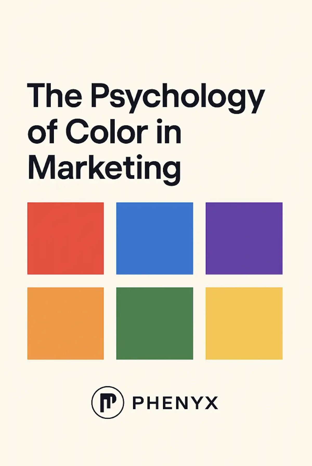
How Brands Use Color to Influence Emotion and Behavior
Color is one of the most powerful tools in marketing. It shapes first impressions, influences decision making, and communicates personality before a single word is read. Whether a brand feels bold, calming, upscale, or playful often comes down to one strategic choice — color.
In 2026, as digital experiences continue to evolve, understanding the psychology of color has become even more important for brands that want to stand out, connect emotionally, and build long-term recognition. At PHENYX, we help businesses intentionally use color to elevate their branding and strengthen their marketing across every platform.
Here’s how color impacts perception and how you can use it to build a brand that truly connects.
Why Color Matters in Branding and Marketing
Before customers read your story or learn your services, they feel your brand. Color sets the mood, communicates the message, and influences how memorable your brand becomes.
Color Influences Emotion
Color can inspire trust, urgency, excitement, calmness, or creativity. That emotional response directly affects buying behavior.
Color Shapes Brand Recognition
Consistent use of brand colors increases recognition and strengthens identity. Think of the brands you know instantly by their color alone.
Color Affects Decision Making
Studies show that color can impact purchasing decisions within seconds. When used intentionally, color becomes a strategic advantage.
The Psychology Behind Common Marketing Colors
Here’s what different colors typically communicate in branding and why brands choose them.
Red: Energy, Passion, Urgency
Red grabs attention and sparks excitement. Great for bold brands, campaigns, or calls to action that need immediate focus.
Blue: Trust, Stability, Professionalism
One of the most widely used colors in branding, especially for tech, finance, and service industries. Blue creates comfort and reliability.
Yellow: Optimism, Warmth, Positivity
Yellow brings a sense of joy and creativity. It’s often used to inspire enthusiasm or highlight key moments.
Green: Balance, Growth, Renewal
Associated with health, wellness, sustainability, and comfort. Green creates a sense of harmony and calm.
Purple: Creativity, Luxury, Imagination
Purple feels elevated and innovative. It’s a strong choice for brands positioning themselves as premium or forward-thinking.
Black & White: Modern, Minimal, Sophisticated
Black and white palettes communicate clarity, confidence, and sharp professionalism. A favorite for modern digital brands.
Orange: Friendly, Energetic, Approachable
Orange blends enthusiasm with warmth. It’s fun, creative, and great for brands that value positivity.
How to Choose the Right Color Palette for Your Brand
Choosing your brand colors is more than picking your favorites. A strategic palette aligns with your audience, voice, and long-term goals.
Know Your Audience
Think about the feelings and impressions your ideal customer responds to. Color should reflect their expectations, not just your personal preference.
Align With Your Brand Voice
If your brand is calm and professional, bright red may not reflect your personality. Your palette should match your message.
Choose Colors That Stand Out Online
Social media is saturated with similar palettes. Choosing intentional, ownable colors helps you stand apart visually.
Consider Accessibility
Colors should be readable for all audiences. High contrast and clean palette structures help improve accessibility and SEO performance.
How PHENYX Uses Color Psychology in Brand Identity
At PHENYX, we help businesses build visual identities that feel modern, intentional, and aligned with their long-term strategy. That includes choosing colors that represent your values and resonate with your ideal audience.
Our branding process includes:
- Deep dive strategy and brand discovery
- Color personality exploration
- Competitive analysis
- Custom color palette development
- Logo and typography pairing
- Full brand guidelines for consistency
Color isn’t just a design choice — it’s a strategic tool that shapes how customers feel the moment they interact with you.
Frequently Asked Questions
Does color really affect customer decisions?
Yes. Research shows color can influence mood, trust, and purchasing decisions within seconds.
Should small businesses care about color psychology?
Absolutely. Strategic color use can help you stand out immediately, even with a small marketing budget.
How many colors should my brand have?
Most strong brands use 1–2 primary colors, 2–3 supporting colors, and a neutral set for balance.
How often should a brand update its color palette?
Most evolve their palette every few years or during a rebrand. Consistency matters, but slight refinements are normal.
Ready to Build a Brand With Intention?
If you want a brand identity that feels cohesive, modern, and emotionally connected, PHENYX can help bring your vision to life. Our team specializes in creating visual systems, messaging frameworks, and marketing strategies that make your brand unforgettable.
Visit phenyx.co to start your branding journey today.