


Decision Driven SEO Dashboards for Agencies: 3 Templates with AI/AEO
An SEO reporting dashboard exists to answer one question: is organic search moving the business forward, and what should happen next? The best ones connect visibility and traffic metrics directly to conversions, give every stakeholder a role-based view suited to their decisions, and run on automated data feeds with a layer of human commentary on top. Everything below shows you how to build that.
TL;DR:
- Dashboards must connect visibility, engagement, outcomes, and technical health metrics, with role-based pages tailored to each stakeholder’s decision-making needs.
- Use a small executive page with five to eight key metrics, drill-through links for diagnostics, and clear ownership of each KPI to ensure actionability.
- Build the dashboard starting with stakeholder interviews to define decisions, then connect data sources, standardize definitions, and set appropriate date controls before chart creation.
- Regularly review and prune dashboards to prevent information overload, ensuring each metric prompts specific actions and reflects current business priorities.
- Secure sensitive data by restricting access based on roles, connecting only necessary sources, and maintaining strict offboarding routines to prevent data breaches.
Table of Contents
- Quick Summary: What Belongs in a Modern SEO Dashboard
- Dashboard Templates You Can Build This Week
- Core SEO KPIs and What They Should Trigger
- Building Role-Based Views That Actually Get Used
- How to Build Your First SEO Dashboard: A Step-by-Step Checklist
- Live Dashboards vs. Scheduled Reports: Choosing Your Cadence
- Best Practices That Keep Dashboards From Being Ignored
- Keeping Client and Company Data Secure in Your Dashboard
- Connecting SEO Dashboards to Your Broader Marketing Stack
- PHENYX Perspective: What We Fix First in a Reporting Audit
- Sources
Quick Summary: What Belongs in a Modern SEO Dashboard
- Track visibility, engagement, conversion, and technical health metrics together, not in isolation.
- Build separate pages for executives, SEO practitioners, and technical teams.
- Pull data from Google Search Console, GA4, a rank tracker, and a crawl tool.
- Set a reporting cadence (live, weekly, or monthly) that matches how each audience actually consumes it.
- Automate data pulls but never automate the analysis. Add commentary manually.
- Include AI and AEO visibility metrics now that generative search reshapes how people find answers.
- First step: interview one stakeholder this week and write down the single decision their dashboard page needs to support.
Dashboard Templates You Can Build This Week
You don’t need to design a dashboard from scratch. Different page types can cover reporting needs and suit various audiences and decisions.
- Executive summary page. Limit this to 4 to 6 widgets: organic sessions trend, organic conversions and revenue where trackable, share of voice or visibility index, and a one-line status flag (on track, at risk, or needs decision). This page should never require scrolling.
- KPI and driver page. This is where SEO practitioners live. Show keyword cluster performance, top landing pages by traffic and conversion rate, and a click-through-rate opportunity table (high impressions, low CTR, page one rankings). Each keyword cluster widget should drill through to the individual queries behind it.
- Technical health page. Core Web Vitals scores, index coverage status from Search Console, crawl error counts, and a log of recent site changes. This page catches the problems that quietly erode the other two.
Wire these together with drill-through links so a flat number on the executive page opens into the diagnostic data behind it. That single design choice turns a static report into something people actually investigate.
Core SEO KPIs and What They Should Trigger
Every metric on a dashboard should earn its place by pointing to an action. If you can’t name what happens when a number moves, cut it.
Group your KPIs into four buckets:
- Visibility: organic impressions, average rank position, share of voice, and now AI/AEO visibility, since generative search platforms increasingly determine how visibility gets captured outside traditional blue links.
- Engagement: organic sessions, click-through rate, landing page bounce or engagement rate.
- Outcomes: conversions, assisted conversions, and revenue tied to organic landing pages where your GA4 setup supports it.
- Technical health: Core Web Vitals, index coverage, crawl errors.
A CTR drop on a page one keyword should trigger a title and meta rewrite review. A jump in crawl errors should trigger an immediate technical audit, not a note for next month’s report.
For date comparisons, default to last month versus the prior month for operational tracking, year-over-year for anything with seasonal traffic patterns, and a rolling 90 day window when you need to smooth out noise. Relative date controls set this way prevent someone from mistaking a seasonal dip for a real performance problem.
Building Role-Based Views That Actually Get Used
A single dashboard trying to serve everyone usually serves no one well. Expert frameworks point toward a three-layer structure: executive, practitioner, and technical analyst, each with its own page and its own level of detail.
- Executive page: headline trend lines only, business language, no more than 5 to 8 charts total to avoid overwhelming a reader who has five minutes.
- Practitioner page: keyword and content performance, opportunity lists, competitive movement.
- Analyst page: raw crawl data, log file patterns, technical diagnostics that feed the practitioner’s opportunity list.
Every metric needs an owner. If a Core Web Vitals score is red, someone on the technical side owns the fix, and that ownership should be visible on the page itself, not buried in a separate project tracker.
Pro Tip: Ask each stakeholder to name the one decision their page should help them make before you build a single chart. If they can’t answer, you’re building a report nobody will open.
How to Build Your First SEO Dashboard: A Step-by-Step Checklist
Start with conversations, not charts. Interview each stakeholder and write down the specific decision their page needs to support. Skipping this step is the single most common reason dashboards get built and then ignored.
- Map each stakeholder to one primary decision their view must inform.
- Clean your data definitions: standardize UTM parameters, filter branded search where relevant, and confirm your GA4 attribution model matches what the outcomes page will report.
- Connect your sources: GSC, GA4, rank tracker, crawl tool.
- Set date control defaults (last month vs. prior, YoY, rolling 90 days) before adding a single chart.
- Build drill paths so headline metrics open into diagnostic detail.
- Add an annotation field for algorithm updates, site changes, and campaign launches.
Following this sequence in order, rather than jumping straight to chart-building, is what separates a dashboard people trust from one they quietly stop checking.
Before launch, run this QA pass:
| QA Check | What to Verify |
|---|---|
| Metric dictionary | Every KPI has a written definition and calculation method |
| Refresh timestamp | Dashboard displays when data last updated |
| Change log | Annotations exist for algorithm updates and site changes |
| Access permissions | Each role sees only its intended page |
Live Dashboards vs. Scheduled Reports: Choosing Your Cadence
Not every audience wants the same delivery format. Executives generally prefer a monthly summary with commentary. Practitioners want something closer to weekly, and technical teams often want alerts the moment something breaks.
- Use a live dashboard in Looker Studio for clients or internal teams who check in whenever they want, without waiting on a report.
- Use a scheduled monthly report for executive audiences who need a fixed narrative and a clear point of comparison.
- Use weekly digests for practitioner teams tracking active campaigns or content pushes.
- Set alerts for crawl errors, ranking drops on priority pages, or Core Web Vitals regressions, and assign an owner to each alert type.
Automation handles the data collection well, but it can’t replace the human read on what a number means. The ‘so what’ and the prioritized next step still need a person to write them every single reporting cycle.
Pro Tip: If your monthly report doesn’t end with a ranked list of next actions, it’s a data dump, not a report. Add three lines: what changed, why it matters, what we’re doing about it.
Best Practices That Keep Dashboards From Being Ignored
Dashboards fail for predictable reasons, and most of them are fixable in an afternoon.
- Cap headline pages at 5 to 8 charts. More than that and nobody reads past the first three.
- Every chart needs a named action attached to it. If you can’t say what decision it informs, remove it.
- Annotate every meaningful change directly on the chart, not in a separate document nobody opens.
- Don’t let vanity metrics (raw impressions with no context) crowd out outcome metrics.
- Review your dashboard quarterly and delete anything nobody has acted on in three reporting cycles.
The most common mistake is building the dashboard once and never revisiting the metric list. Traffic patterns shift, business priorities change, and a KPI that mattered in January can be dead weight by summer. Set a recurring calendar reminder to audit the dashboard itself, not just the numbers on it.
Keeping Client and Company Data Secure in Your Dashboard
SEO dashboards often pull together Search Console properties, GA4 accounts, and sometimes CRM or revenue data, which means they carry more sensitive information than most people realize.
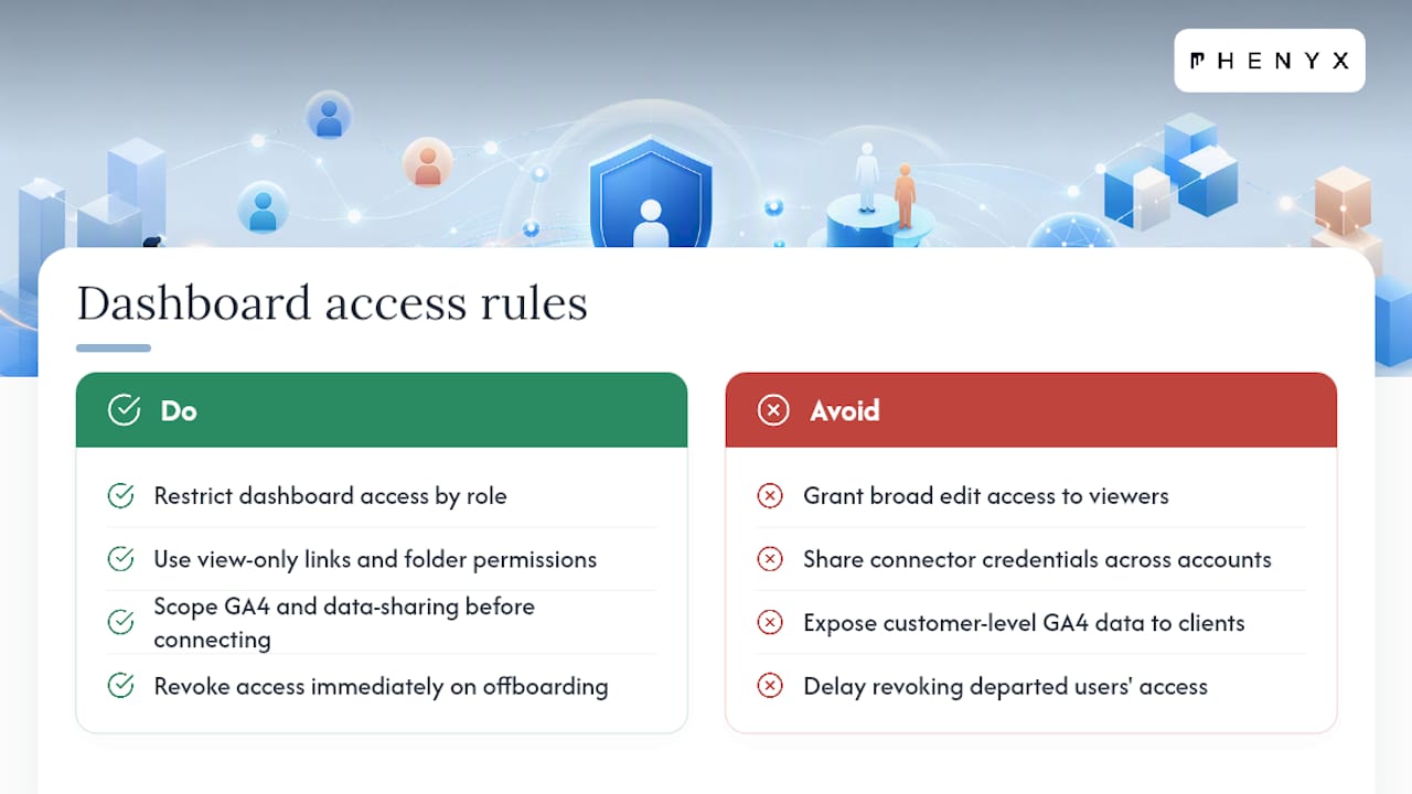
Restrict dashboard access by role. An executive viewing a summary page doesn’t need edit access to the underlying data connections, and a contractor pulling reports for one client shouldn’t see every account in your portfolio. Most BI platforms, including Looker Studio, support view-only sharing links and folder-level permissions. Use them.
Be deliberate about what you connect. If a dashboard pulls GA4 data that includes any customer-level detail, confirm your data-sharing settings and user permissions are scoped correctly before you grant broader access to a client team. Revenue and pipeline data tied to landing pages should sit behind tighter access controls than a traffic trend chart.
For agencies managing multiple client accounts, keep each client’s data source connections separate. A shared connector credential across accounts creates unnecessary risk if one login gets compromised, and it makes an access audit far harder to complete cleanly.
Set an offboarding routine too. When a team member or contractor leaves a project, revoke their dashboard and data source access immediately rather than at the next scheduled review. This one habit prevents most access sprawl that agencies discover only after something has already gone wrong.
Connecting SEO Dashboards to Your Broader Marketing Stack
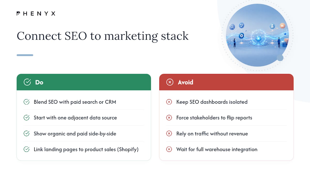
An SEO dashboard that lives in isolation misses half the story. Organic search rarely acts alone. It works alongside paid campaigns, email, and content initiatives, and a dashboard that can’t show that context will constantly get second-guessed by stakeholders comparing it to other channel reports.
Most BI platforms support blending SEO data with paid media, CRM, or e-commerce platforms. Looker Studio can combine a GSC data source with a Google Ads connector on the same page, letting you show organic and paid performance side by side without forcing a stakeholder to flip between two separate reports. For teams running on Shopify, blending organic landing page data with product-level sales data closes the loop between rankings and revenue far better than traffic numbers alone.
Larger organizations running dedicated business intelligence platforms often pull SEO data into the same warehouse as sales and finance reporting. This makes sense once organic search becomes a meaningful revenue channel worth measuring against company-wide targets rather than treating it as a marketing-only metric.
The practical starting point is smaller: pick one adjacent data source, usually paid search or CRM conversions, and add it to your existing dashboard before attempting a full warehouse integration. A marketing dashboard built around decisions rather than channels tends to surface cross-channel insight a siloed SEO report never will.
PHENYX Perspective: What We Fix First in a Reporting Audit
Most SEO dashboards we review have plenty of data and almost no decisions attached to it. Our approach starts by mapping every chart to an action before adjusting layouts, based on a structured audit process informed by experience and data patterns.
Three checks you can run today: count your headline widgets (cut anything past eight), ask whether your AI/AEO visibility metrics exist anywhere on the page, and confirm every red or declining number has a named owner attached to it. If any of those fail, you don’t need a bigger dashboard. You need a smaller, sharper one.
If your current setup needs more than a metric cleanup, our SEO and AEO services team can rebuild the reporting structure alongside the underlying strategy.
— PHENYX
Sources
Your KPIs are only as good as the data feeding them. Google Search Console covers impressions, average position, and click-through rate. GA4 covers sessions, engagement, and conversions. A rank tracker fills in daily position data at a granularity Search Console doesn’t offer, and a crawl tool covers technical health.
For connecting these into one dashboard, you have three real options:
Looker Studio remains the strongest free option for live, client-facing dashboards built on GSC and GA4, though a proper GA4 conversion setup needs to be in place first or the whole outcomes bucket collapses.

