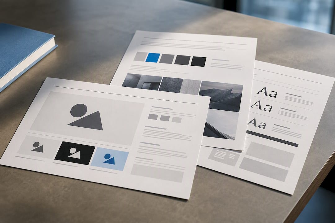

Ship a Working Brand Style Guide in 3 Pages for Teams
A brand style guide is the rulebook that governs how your logo, colors, typography, voice, and imagery show up everywhere, from your website to your invoices. Its immediate payoff is speed and consistency: teams stop guessing and start producing on-brand work faster, whether that’s a social post or a full site redesign. A solid guide covers the core components, the process for documenting them, and templates you can copy today.
TL;DR:
- Most brand guides fail when no one is assigned ownership, leading to outdated or ignored instructions that cause recurring brand inconsistencies.
- Including clear visual examples of correct and incorrect logo, color, and typographic usage significantly reduces common mistakes in applying brand rules.
- Small teams can start with a simple PDF or web page, but larger teams benefit from hosted connected formats like Figma to ensure easier updates and consistency.
- Regular reviews every six to twelve months, led by a designated owner, are essential to keep the guide current and effective across all communication channels.
- Accessibility considerations, such as contrast ratios and alt text, along with AI guardrails, are now essential components to prevent broken assets on modern screens and platforms.
Table of Contents
- Quick Summary: Building a Brand Style Guide
- What Is a Brand Style Guide, Exactly?
- What Goes in a Brand Style Guide?
- How to Build a Brand Style Guide Step by Step
- Which Format Should You Use: PDF, Web, or Figma?
- Do’s and Don’ts Every Guide Should Include
- Who Should Own and Update the Guide?
- Accessibility and AI Guardrails to Add Now
- Where to Find Real Brand Style Guide Examples
- PHENYX’s Take: Why Most Brand Guides Fail
- Get Help Building a Brand Style Guide That Actually Gets Used
- Sources
- FAQ
Quick Summary: Building a Brand Style Guide
Before you dig into the full breakdown, here’s what matters most if you’re building or commissioning a guide right now.
- Document your logo system, color palette, and typography first. These get misused the most.
- Follow a simple sequence: audit existing assets, lock your strategy, document the rules, publish, then govern.
- Start with a PDF or web page if your team is small; move to a connected library like Figma once more than two people produce assets.
- Assign a named owner and set a review cadence. A guide with no owner becomes shelfware fast.
- Include accessibility basics: contrast ratios, legible type sizes, and alt-text conventions.
- Pull inspiration from public brand guide archives rather than starting from a blank page.
- Pair every rule with a visual “do” and “don’t” example so nobody has to ask twice.
What Is a Brand Style Guide, Exactly?
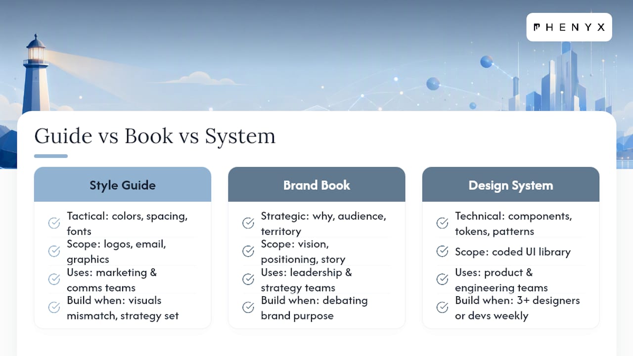
A brand style guide is a tactical document. It tells someone exactly which blue to use, how much white space surrounds your logo, and whether your headline font is bold or regular. A brand book, by contrast, is strategic. It explains why the brand exists, who it serves, and the emotional territory it owns. Both matter, but they answer different questions.
A design system sits one level deeper still. It’s a living library of coded components, tokens, and reusable UI patterns, usually built for product and engineering teams working inside software. Most small and midsize businesses don’t need a full design system on day one. They need a clear, workable style guide.
How do you know which one to build? If your team already agrees on brand strategy but keeps producing mismatched graphics, wrong logo colors, or inconsistent email signatures, you need a style guide now, not a rebrand. If you’re still arguing about who your brand is for, start with the brand book instead. And if you have three or more designers or developers touching the same assets weekly, plan to graduate toward a connected system once the basics are locked.
What Goes in a Brand Style Guide?
A useful brand style guide documents logo usage, color, typography, voice, and imagery so it works as a single source of truth for internal teams and outside vendors alike. Here’s what belongs in each section, with the level of detail that actually prevents mistakes.
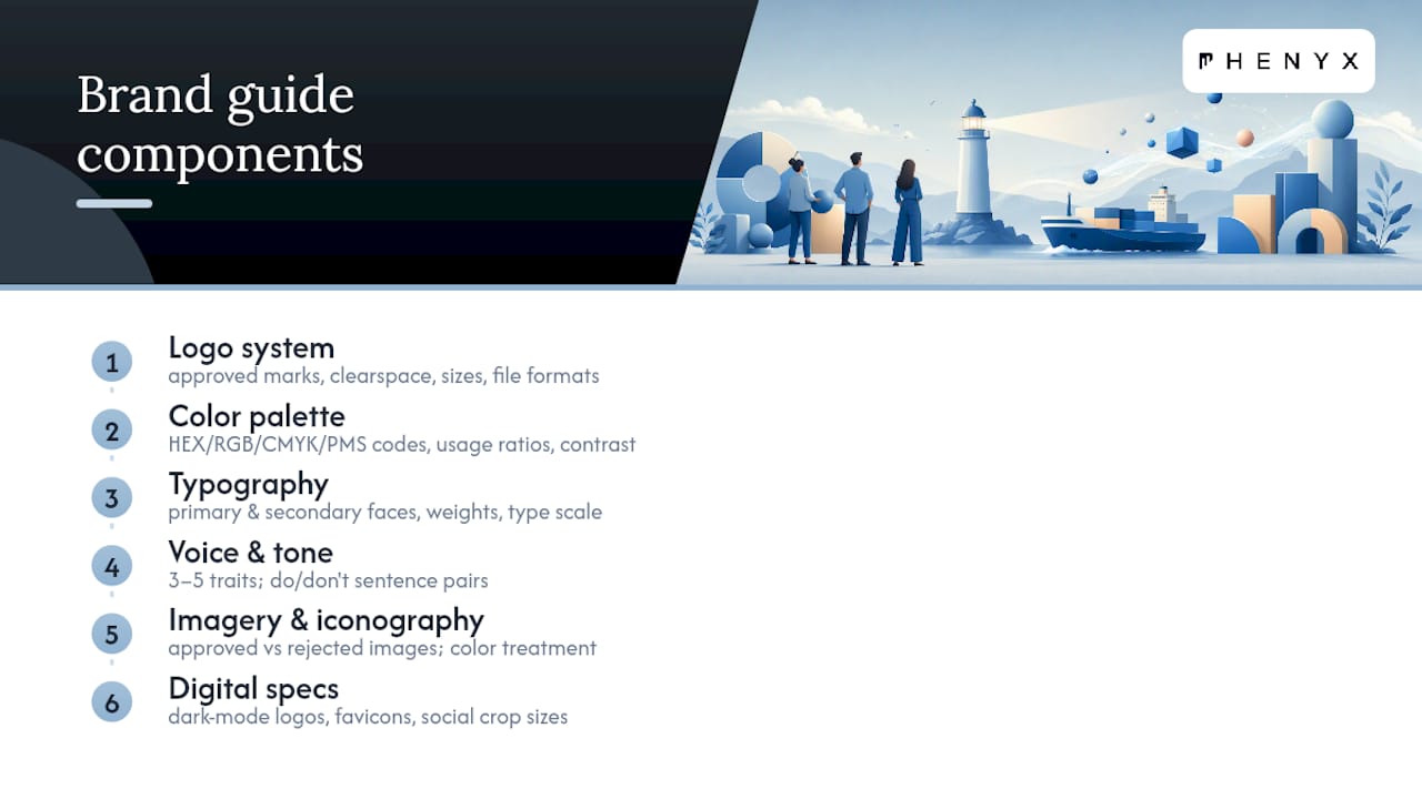
Logo system. List every approved mark (primary, secondary, icon-only, wordmark), the minimum clear space around each one, the smallest size it can print or display at, and the file formats to use (SVG for web, EPS for print, PNG for quick drops). Show at least one incorrect example, like a logo squeezed into an oval or dropped onto a busy photo.
Color palette. Give exact values, not descriptions. Primary and secondary colors need HEX, RGB, CMYK, and Pantone (PMS) codes so print vendors and web developers match precisely. Note usage ratios too. A minimal starter guide should still include exact HEX, RGB, and CMYK codes along with web font fallbacks to prevent drift the moment a freelancer or new hire opens a file. Flag which color combinations pass accessibility contrast checks.
Typography. Name your primary and secondary typefaces, their weights, and a type scale (H1 through body text) with point sizes. Include a web-safe fallback font for browsers that can’t load your custom typeface.
Voice and tone. List three to five voice traits (say “direct” or “warm,” not “good”), then show how tone shifts across contexts, a sales email reads differently than a support reply or a social caption. Include one do/don’t sentence pair per trait.
Imagery and iconography. Define the subject matter you photograph, your color treatment (warm, desaturated, high contrast), and show one approved image next to one rejected image with a one-line reason.
Digital specs. Cover dark-mode logo variants, favicon sizing, and social media crop dimensions for each platform you post on.
How to Build a Brand Style Guide Step by Step
Building a guide isn’t complicated, but skipping steps is exactly how guides end up incomplete or ignored six months later. Work through these five phases in order.
- Audit. Collect every logo file, color swatch, font, and old marketing piece currently in use across your business. Note where things already conflict, three different blues, two logo versions, inconsistent email signatures. Deliverable: a simple asset inventory spreadsheet.
- Lock your strategy. Write a one-sentence brand promise and a one-paragraph audience definition before you touch design decisions. Skipping this step is why most guides feel arbitrary.
- Document. Build the visual core first: logo, color, and type. Pair every single rule with a visual example, since a rule without an example gets misread. Add voice and tone once the visual foundation is solid.
- Publish. Choose a format that matches your team size, then set access permissions so the right people can view or edit.
- Govern. Name one person as the owner, schedule a review every six to twelve months, and walk new hires or vendors through the guide directly instead of just emailing a link.
Pro Tip: Don’t try to document every possible scenario on day one. Publish the core rules for logo, color, and type first, then add voice and imagery guidance as real questions come up. A guide that ships imperfect and gets used beats a “perfect” one still sitting in a designer’s drafts folder.
Which Format Should You Use: PDF, Web, or Figma?
A static PDF is easy to produce and share, but it goes stale the moment a color code or logo file changes. Living formats, web portals, Figma libraries, and other connected tools, reduce that drift and make updates far easier to push out to everyone at once.
Connected design systems built on tokens make the most sense once more than two people regularly produce brand assets; smaller teams often do fine with a concise PDF or a single web page. Match the format to your team, not to what looks impressive.
If you’re starting from scratch, your first three pages should cover:
- Page one: Logo system with clear space, minimum size, and file types.
- Page two: Full color palette with HEX, RGB, CMYK, and PMS codes.
- Page three: Typography hierarchy with web fallback fonts listed.
That gives anyone on your team enough to produce on-brand work immediately, even before voice and imagery sections exist.
Do’s and Don’ts Every Guide Should Include
A dedicated do/don’t section is one of the highest-value additions you can make. Explicitly showing what not to do prevents the majority of common brand errors before they happen, because most mistakes come from assumption, not intent.
Visual don’ts to flag:
- Stretching or squeezing the logo to fit a layout.
- Recoloring the logo outside approved variants.
- Placing the logo on a busy photo or a background with insufficient contrast.
Verbal don’ts to flag:
- Corporate jargon your brand voice specifically avoids.
- A formal tone in channels meant to sound conversational (or vice versa).
- Words or phrases banned for legal, tone, or positioning reasons.
Format each pair side by side: show the correct version, then the incorrect version, with one line explaining why. That single visual contrast does more to prevent repeated errors than three paragraphs of written instruction ever will.
Who Should Own and Update the Guide?
A guide with no home dies fast. Host it somewhere your whole team can reach without asking permission every time, a shared drive folder, an internal wiki, or a dedicated web page depending on your tools and team size. Set two access levels: full edit rights for the owner, view-only for everyone else.
Naming an owner, setting a clear update cadence, and training people on the guide substantially increases adoption and keeps it from turning into forgotten shelfware. That owner should also run a short onboarding walkthrough for new hires or contractors, rather than assuming they’ll read a PDF cover to cover.
To measure whether the guide is actually working, track something simple: how often you’re still correcting logo misuse, off-brand colors, or tone mismatches in reviewed work each month. A declining error count is your clearest signal that the guide is doing its job. Consistency, showing up the same way across every touchpoint, builds a stronger brand than chasing a fresh look every quarter.
Accessibility and AI Guardrails to Add Now
Modern guides need to plan for screens your brand didn’t exist on ten years ago. Accessibility guidance, particularly contrast ratios, keeps your brand readable for people using screen readers or viewing your site in bright sunlight on a phone.
- Check color pairs against WCAG contrast minimums; dark navy on white typically passes, light gray on white usually fails.
- Set a minimum body text size and confirm your primary font stays legible at small sizes on mobile.
- Require alt text for every approved image, written in your brand voice, not just a generic file description.
- Set AI guardrails: name which tools are approved for drafts or image generation, require human review before anything publishes, and give writers prompt patterns that preserve your voice traits instead of defaulting to generic AI phrasing.
None of this is optional anymore. A guide missing dark-mode logo variants or contrast guidance will produce broken-looking assets the first time someone builds a dark-themed landing page or ad.
Where to Find Real Brand Style Guide Examples
You don’t need to build from a blank page. Public archives and curated repositories of brand manuals give you real structure to study, including how other companies organize their sections, phrase their rules, and lay out do/don’t pairs.
Use these as inspiration, never as a template to copy verbatim, since your color codes, voice, and imagery need to reflect your own brand, not someone else’s.
- Borrow the logo system layout. How they show minimum size and clear space visually.
- Borrow voice samples. How tone shifts across a tagline versus a product description.
- Borrow digital tokens. How color and type variables are organized for developers.
Scale a strong example down by cutting sections your team doesn’t need yet (skip the full icon library if you don’t have custom icons). Scale one up by adding a governance section once you have more than a handful of contributors touching brand assets regularly.
PHENYX’s Take: Why Most Brand Guides Fail
Most brand style guides don’t fail because the color codes are wrong. They fail because nobody owns them, examples are missing, and the document lives in a folder nobody opens twice.
The pattern repeats across small businesses and growing companies alike: a designer builds a beautiful guide, hands it off, and six months later the sales team is using an old logo version because nobody told them otherwise. Pairing every rule with a visual example fixes most of that friction on its own, since teams stop guessing and start matching.
A structured approach to building and rolling out a brand guide, one with a named owner, a governance cadence, and hosting that people actually use, tends to produce fewer brand errors, faster asset turnaround, and more consistent campaigns across channels. That’s the difference between a document and a working system.
— PHENYX
Get Help Building a Brand Style Guide That Actually Gets Used
A DIY guide works fine when one person handles all your design. Once you’re briefing freelancers, running ads across three platforms, or launching a new site, a guide built without brand and web expertise combined tends to fall apart at the seams.

Brand style guides are often built as part of a connected process, with branding, graphic design, and website work handled by an integrated team rather than separate vendors. That means your logo rules, color palette, and typography standards get built directly into your website redesign rather than handed off as a static PDF nobody opens again. We also fold your visual identity into ongoing SEO and AEO work, so your brand shows up consistently in search results and metadata, not just on the page.
If your current guide is outdated, missing, or unused, consider consulting a professional for a website redesign and advice on integrating a well-documented brand identity into the rebuild.
Sources
- How to Create a Brand Style Guide (HubSpot PDF)
- How To Create Brand Guidelines: Brand Style Guide Template (Shopify)
- Brand Style Guide: How to Build One Complete 2026 Guide (Orbix)
- Brand consistency—the competitive advantage (Marq)
FAQ
What Is a Brand Style Guide?
A brand style guide is a document that sets rules for how a brand’s logo, colors, typography, voice, and imagery appear across every touchpoint, so teams and outside vendors stay consistent without needing constant clarification.
What Are the 5 C’s of Branding?
Definitions vary across sources, but a common version includes clarity, consistency, character, credibility, and connection, five traits a strong brand identity aims to hit across every piece of communication.
What Are the 7 Pillars of Branding?
There’s no single universally agreed list, but common frameworks typically cover purpose, positioning, visual identity, voice, experience, culture, and consistency as the core pillars a brand builds around.
What Is the 3-7-27 Rule in Branding?
This isn’t a standard, widely documented branding principle, so treat any specific version you encounter with caution rather than as an established rule.
How Often Should a Brand Style Guide Be Updated?
Most guides benefit from a review every six to twelve months, with a named owner responsible for checking that colors, logo files, and voice examples still match how the brand actually shows up.