


PPC Landing Pages That Actually Convert: 2026 Guide
A PPC landing page is a dedicated page built to convert paid clicks into leads or sales, and the most important focus is message match: the alignment between your ad copy, the keyword intent, and what the page says and offers. Other optimizations, from form length to load speed, build on that foundation.
Quick Summary
- A dedicated landing page removes navigation and focuses visitors on one action, which is why it typically outperforms sending paid traffic to a homepage.
- Message match between your ad headline and page headline is the highest-leverage conversion factor.
- Core page elements include a clear headline, benefit-focused copy, a single CTA, a short form, and trust signals.
- Tracking requires Google Ads conversion actions, GA4 events, and consistent UTM parameters on every paid URL.
- A/B testing should start with headlines and CTA placement before moving to design or layout changes.
- Industry benchmarks vary by vertical, so set your targets against your specific industry median, not a single universal number.
Key Takeaways
Dedicated PPC landing pages convert paid clicks most effectively when message match, tracking, and testing are treated as equally important as design.
| Point | Details |
|---|---|
| Message match first | Align your ad headline, keyword intent, and landing page headline before optimizing anything else. |
| Track before you launch | Set up Google Ads conversion actions and GA4 events on every page before sending paid traffic. |
| Test headlines first | Headline optimization delivers the highest average lift in A/B tests across landing page elements. |
| Use industry benchmarks | Compare your conversion rate against your vertical’s median, not a universal average. |
| Phenyx handles the full stack | Phenyx builds pages, sets up tracking, and runs paid-traffic tests as one integrated service. |
Table of Contents
- When should you use a dedicated landing page for PPC?
- What are the core elements of a high-converting PPC landing page?
- How does message match work between your ad and landing page?
- Does your landing page design hold up on mobile?
- What KPIs and tracking should you set up for PPC landing pages?
- How do you run A/B tests on PPC landing pages?
- What do high-performing PPC landing page templates look like?
- What mistakes do PPC teams make most often on landing pages?
- How does Phenyx approach building and measuring PPC landing pages?
- Ready to build landing pages that convert paid traffic?
- Sources
When should you use a dedicated landing page for PPC?
A dedicated PPC landing page has one offer, one CTA, and no site navigation pulling visitors away. Its entire job is to convert the click you just paid for. That focus is what separates it from a homepage or a standard product page, both of which serve multiple audiences with multiple goals.
Research consistently shows that dedicated pages are the right destination for most paid traffic, but not all of it. Here is a practical decision framework:
Use a dedicated landing page when:
- You are running a lead-gen campaign with a specific offer (free audit, demo, quote).
- You have high-volume ad groups targeting distinct keywords or audience segments.
- You are promoting a single product, service, or limited-time offer.
- You want to test messaging without changing your live website.
Use an existing website page when:
- The campaign targets branded search terms from warm or returning audiences.
- Visitors are in a research phase and need full product detail, specs, or comparison content.
- The product page already converts well and the incremental lift from a dedicated page is not worth the build cost.
Dedicated landing pages can have higher signup conversion rates than most other opt-in mechanisms, yet they remain underused compared to pop-ups and site-wide forms. That gap is an opportunity most advertisers leave open.
Pro Tip: If your page is built purely for a paid campaign and you do not want it ranking organically (for example, a seasonal promo with a short shelf life), add a noindex meta tag. For evergreen lead-gen pages where organic traffic would be a bonus, let them be indexed and treat SEO as a free second channel.
What are the core elements of a high-converting PPC landing page?
The page components below are not a style guide. They are the structural elements that directly affect conversion rate, and each one has a job to do.
Hero area
Your headline is the first thing a visitor reads and the most important copy on the page. It must mirror the ad that brought the visitor here (more on that in the next section). The subheadline adds one layer of specificity: the primary benefit or the “why now.” A supporting image or short video above the fold should reinforce the offer visually, not just decorate the page. Place your primary CTA button above the fold so visitors never have to scroll to take action.
Value propositions and benefit-focused copy
Three to five bullet points that translate features into outcomes work better than paragraphs of product description. Map each bullet directly to a promise made in the ad. If your ad said “Get more leads in 30 days,” your bullets should explain how, not pivot to a different message.
Form optimization
Shorter forms convert at higher rates, but “shorter” is relative to the offer. A free checklist download warrants a name and email. A B2B demo request can justify four to six fields if the offer is high-value. Use autofocus on the first field, enable autofill, and add a one-line privacy note near the submit button. Progressive profiling, where you ask for more information after the initial conversion, lets you keep the first form short without losing data.

Trust and social proof
Logos of recognizable clients or media mentions, a short testimonial with a real name and company, a security badge near the form, and a brief privacy statement all reduce hesitation. Even a single specific stat (“Helped 200+ businesses increase leads”) carries more weight than a generic claim.
UX and layout checklist
- Single, unambiguous CTA (one button color, one action verb).
- Visual hierarchy that guides the eye from headline to proof to form.
- Directional cues (arrows, gaze direction in photos) pointing toward the CTA.
- No main navigation menu (a logo link back to the homepage is acceptable).
- Mobile-first layout with tap-friendly button sizes (minimum 44px height).
- Page load under three seconds on mobile.
How does message match work between your ad and landing page?
Message match is the degree of continuity a visitor experiences from the moment they see your ad to the moment they read your landing page headline. When the match is tight, visitors feel they are in the right place. When it breaks, they leave.
The chain works like this:
Keyword → Ad headline → Landing page headline → Supporting proof
A visitor searching “PPC management for small business” clicks an ad that says “Affordable PPC Management for Small Businesses.” They land on a page with the headline “PPC Management Built for Small Business Budgets.” The subheadline adds: “No long contracts. Transparent reporting. Results in 30 days.” Every step reinforces the same promise.
Break that chain anywhere and you lose trust. Sending that same visitor to a generic “Digital Marketing Services” page is the most common and most costly message-match failure in paid search.
Practical checks to run before launching:
- Read your ad headline and your landing page headline back to back. Do they feel like the same conversation?
- Confirm the offer in the ad matches the offer on the page exactly (same price, same deliverable, same timeline).
- Check that the URL slug reflects the campaign topic (e.g.,
/ppc-management-small-business, not/services). - For campaigns with multiple ad groups targeting different audiences, build separate pages. One page for “PPC for restaurants” and a different page for “PPC for law firms” will outperform a single generic page every time.
Audience-focused experiments consistently outperform checklist-driven redesigns because they treat message match as a learning process, not a one-time setup task.
Does your landing page design hold up on mobile?
Mobile visitors now make up the majority of paid search traffic in most industries, and a page that looks polished on desktop but breaks on a phone will drain your budget quietly. Design for the thumb, not the cursor.
Mobile UX priorities:
- Stack content vertically. Two-column layouts that work on desktop often collapse awkwardly on small screens.
- Place the CTA button within thumb reach, typically centered or full-width near the bottom of the above-fold area.
- Use tap targets of at least 44x44 pixels for all interactive elements.
- Compress images to WebP format and lazy-load anything below the fold.
- Avoid full-screen video autoplay, which increases load time and can feel intrusive on mobile.
Core Web Vitals and page speed
Google uses Core Web Vitals as part of its Quality Score calculation for landing pages. The three metrics that matter most for paid pages are Largest Contentful Paint (LCP), Interaction to Next Paint (INP), and Cumulative Layout Shift (CLS). Measure them with Google PageSpeed Insights or the Core Web Vitals report in Google Search Console.
For a landing page specifically, LCP is usually the most actionable metric. A slow-loading hero image is the most common culprit. Preload your hero image, serve it at the correct display size, and use a CDN if your hosting does not already include one.
Pro Tip: Before requesting a full dev sprint, run your page through PageSpeed Insights and fix the top three recommendations yourself: compress the hero image, remove render-blocking scripts, and defer any third-party tags (chat widgets, analytics) that are not critical to the above-fold experience. These three changes alone often move LCP from “poor” to “needs improvement” without touching the codebase.
What KPIs and tracking should you set up for PPC landing pages?
Tracking is not optional. Without it, you are spending money and guessing at results. Set up these three layers before you send a single paid click to the page.
Layer 1: Google Ads conversion actions. Create a conversion action in Google Ads for every meaningful event: form submission, phone call, purchase, or app install. Import GA4 goals into Google Ads or use the Google Ads tag directly. Use “primary” conversion actions for bidding and “secondary” ones for observation.
These give you behavioral data that Google Ads alone does not capture, including which page sections visitors engage with before converting.
Layer 3: UTM parameters. Tag every paid URL with utm_source, utm_medium, utm_campaign, utm_content, and utm_term. Consistent tagging lets you compare landing page performance across ad groups, devices, and campaigns without data gaps. Inconsistent UTMs are the single most common reason attribution breaks in GA4.
For deeper measurement strategy, Phenyx’s guide on ad tracking and measurement covers how to connect these layers into a coherent attribution picture.
KPIs to monitor
WordStream’s 2026 Google Ads benchmarks, drawn from over 13,000 campaigns run between April 2025 and March 2026, show that average conversion rates and CPL vary significantly by industry. Use those industry-level averages as your baseline, not a single universal target.
Benchmark insight: CorePPC’s 2026 data shows that median landing page conversion rates differ meaningfully by vertical, with top-quartile pages often converting at two to three times the industry median. A practical goal: exceed your vertical’s median by 20%.
How do you run A/B tests on PPC landing pages?
A/B testing on paid traffic is faster and cleaner than on organic traffic because the audience intent is more consistent. A visitor who clicked a paid search ad for “B2B CRM demo” is a more homogeneous test subject than a random organic visitor browsing your blog.
The testing framework:
- Hypothesis first. State what you expect to change, why, and by how much. “Changing the CTA from ‘Submit’ to ‘Get My Free Audit’ will increase form submissions by 15% because it communicates value rather than effort.”
- One variable at a time. Testing headline and CTA simultaneously makes it impossible to know which change drove the result.
- Sample size before you start. Use a statistical significance calculator (many are free online) to determine how many conversions you need in each variant before declaring a winner. Running tests too short is the most common mistake.
- Minimum two weeks. Even with high traffic, run tests across at least two full weeks to account for day-of-week variation.
- Segment by device and source. A headline that wins on desktop may lose on mobile. A message that resonates with search traffic may underperform with display traffic.
What to test first, in priority order:
- Headline (highest average lift per DollarPocket’s analysis of 50,000+ pages)
- CTA button text and placement
- Form field count
- Hero image or video
- Offer framing (free trial vs. free demo vs. free consultation)
Pro Tip: Paid traffic gives you cleaner test signals than organic because intent is more uniform. Early leaders reverse more often than most marketers expect.
What do high-performing PPC landing page templates look like?
Templates are starting points, not finished pages. Each pattern below maps to a specific campaign type and comes with notes on what to replicate and what to test.
Lead-gen contact form
Best for: Service businesses, agencies, B2B companies. The hero area carries a specific outcome headline (“Get a Free PPC Audit in 24 Hours”), a three-bullet benefit list, and a short form (name, email, phone, company size). Trust signals sit directly below the form: client logos, a one-line testimonial, and a privacy note. Test the number of form fields first; removing one field often lifts conversion rate more than any design change.
Ecommerce product landing page
Best for: Single-product promotions, seasonal campaigns, new launches. Lead with the product image and a benefit-driven headline, not the product name. Price and a clear “Add to Cart” or “Buy Now” CTA belong above the fold. Below the fold: three to five benefit bullets, social proof (review count and star rating), and a brief FAQ addressing the top purchase objection. Test the headline framing (outcome vs. product feature) and the CTA color.
Demo signup
Best for: SaaS, software, B2B tools. The page needs to answer one question immediately: “What will I see in the demo?” A short video (60 to 90 seconds) showing the product in action reduces form abandonment significantly. Keep the form to three fields maximum. Add a calendar embed or a “choose your time” option to reduce the friction of back-and-forth scheduling.
App install
Best for: Mobile apps, consumer tools. The hero should show the app on a phone screen with a headline focused on the primary use case, not the app name. App store badges (Apple App Store, Google Play) serve as both CTAs and trust signals. Include one or two user review quotes and a short feature list. Test the headline against a social-proof-led variant (“Join 50,000 users who…”).
Quiz or qualification funnel
Best for: High-ticket services, insurance, financial products, personalized recommendations. A multi-step form that starts with a low-commitment question (“What’s your biggest marketing challenge?”) converts better than a single long form because it creates momentum. Each step should feel like progress. The final step collects contact information. Test the opening question wording and the number of steps.
Choosing the right template: Match the template to the campaign’s primary conversion goal. If the goal is a contact, use lead-gen. If it is a purchase, use ecommerce. If the offer requires explanation, use demo or quiz. Sending high-intent search traffic to a quiz funnel when a simple form would do adds unnecessary friction.
What mistakes do PPC teams make most often on landing pages?
Most conversion problems trace back to a small set of repeatable errors. Here are the ones Phenyx sees most frequently, along with direct fixes.
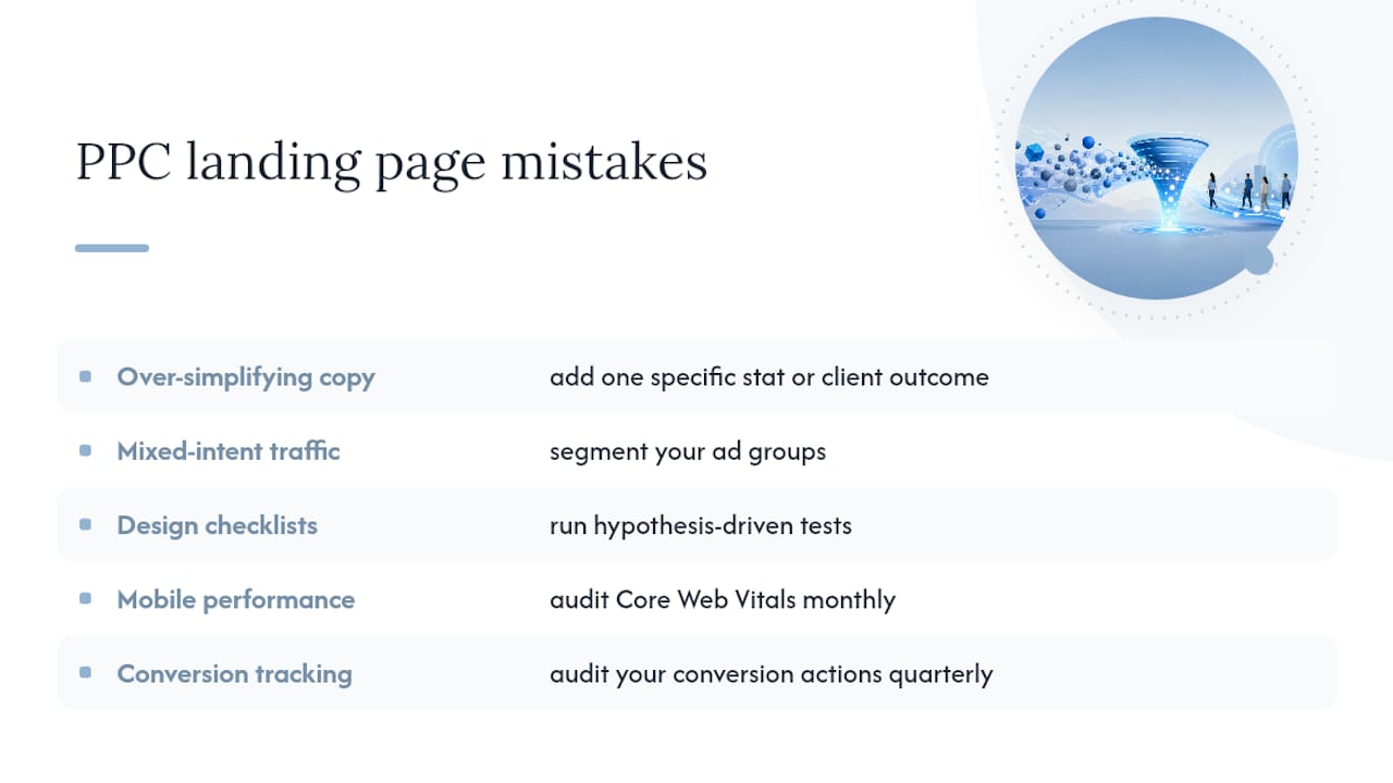
Mistake 1: Over-simplifying copy and stripping necessary context. Minimalism is not the same as clarity. Removing proof, context, or benefit detail in the name of “clean design” leaves visitors without the information they need to convert. Fix: add one specific stat, one client outcome, or one concrete benefit detail that directly supports the offer.
Mistake 2: Sending mixed-intent traffic to one page. A single landing page for a campaign targeting both “PPC management” and “what is PPC” will underperform for both audiences. Fix: segment your ad groups and build a dedicated page for each distinct audience or intent cluster.
Mistake 3: Treating design checklists as a substitute for testing. A page that checks every design box can still underperform if the messaging does not resonate with the specific audience. Dedicated pages can underperform when they ignore visitor needs, even when they look polished. Fix: run hypothesis-driven tests that generate audience insights, not just element swaps.
Mistake 4: Ignoring mobile performance. A page that loads in six seconds on mobile loses a significant portion of its paid traffic before the headline even renders. Fix: audit Core Web Vitals monthly and treat LCP above three seconds as a conversion blocker, not a cosmetic issue.
Mistake 5: Missing or broken conversion tracking. If your Google Ads account is not recording conversions accurately, your Smart Bidding algorithms are optimizing toward the wrong signal. Fix: audit your conversion actions quarterly and verify that GA4 events fire correctly using the DebugView in GA4 and the Google Tag Assistant.
Pro Tip: Prioritize fixes by impact-to-effort ratio. Message match and tracking accuracy are high-impact, low-effort fixes that should come before any design work. Mobile speed is high-impact but may require dev time. Layout redesigns are high-effort and should only follow after you have validated the messaging.
How does Phenyx approach building and measuring PPC landing pages?
Phenyx follows a structured process that moves from discovery to measurable results without the back-and-forth of working across multiple vendors.
The Phenyx process, in brief:
- Discovery and message architecture: Map the campaign’s keyword intent, audience segment, and offer to a clear message hierarchy before a single pixel is designed.
- Rapid template build: Use a proven structural template as the starting point, then customize headline, proof elements, and form to match the specific campaign.
- Tracking setup: Install Google Ads conversion actions, GA4 events, and UTM parameters as part of the build, not as an afterthought.
- Paid-traffic testing: Launch with a primary variant and a challenger, segment results by device and traffic source, and run tests to statistical significance before rolling out winners.
- Measurement and rollout: Report on CPL, conversion rate, and Quality Score improvement, then apply winning patterns to other campaigns.
Phenyx delivers landing page builds, full tracking setup, and documented test plans as part of its paid ads and PPC service. For businesses running Google Ads locally, the practical budgeting and targeting guidance in this Google Ads guide for local businesses pairs well with a dedicated landing page strategy.
Pro Tip: Phenyx recommends integrating a short product or service video (60 to 90 seconds) into demo and lead-gen landing pages. Video increases time on page and gives visitors a reason to stay long enough to convert. Phenyx’s in-house video production team builds these assets as part of the same campaign workflow, so the visual language stays consistent from ad creative to landing page.
What Phenyx practitioners actually think about PPC landing pages
Speed versus precision is a real trade-off. Getting a page live quickly with a proven template is almost always better than waiting for a perfect page. The first version of any landing page is a hypothesis, not a finished product.
When a tested pattern already exists for your campaign type (lead-gen for a service business, demo signup for a SaaS tool), replicate it before running a new structural test. Save new tests for messaging and offer framing, where audience-specific learning compounds over time.
Three rules Phenyx follows in client work:
- Never launch a paid campaign without verified conversion tracking in place.
- Always test the headline before testing design or layout.
- Treat every test as a question about the audience, not just a check on a design element.
Ready to build landing pages that convert paid traffic?
Phenyx builds conversion-focused landing pages as part of a fully integrated paid ads and PPC service, covering everything from message architecture and design to tracking setup and ongoing optimization. You get one team handling the page, the campaign, and the measurement, which means no gaps between what the ad promises and what the page delivers.
The practical next step is a quick audit of your current landing pages against the message-match and tracking checklist in this guide. If you would rather have Phenyx run that audit and build a pilot page for your next campaign, see how Phenyx approaches website and landing page builds and reach out to start a conversation.
Sources
- Google Ads Benchmarks 2026: Competitive Data & Insights for Every Industry | WordStream
- Landing Page Conversion Rate Benchmarks by Industry (2026) | COREPPC
- Landing Page vs Website: What to Use When You’re Running Paid Ads | LanderLab
- Are Dedicated Landing Pages Hurting Your Conversion Rate? | Search Engine Journal
- Involve