


Marketing Dashboard Metrics That Actually Drive Decisions
Every marketing dashboard needs the same core: 5 to 7 hero KPIs covering pipeline or revenue, CAC, ROMI or ROAS, conversion rates, and lead quality, each shown with comparative context. Apply the Decision Test to every widget you’re tempted to add: when you look at this number, what decision will you make? If the answer is “none,” cut it.

That single filter solves most dashboard problems before they start. Here’s what to do this week:
The rest of this guide breaks down the specific KPIs, the templates built around them, and the audit process that keeps your dashboard honest quarter after quarter.
Key Takeaways
A marketing dashboard drives decisions only when it limits itself to 5 to 7 hero KPIs, each shown with comparative context and a single accountable owner.
| Point | Details |
|---|---|
| Apply the Decision Test | Keep only metrics that answer “what decision will I make from this?” |
| Limit hero KPIs | Cap each dashboard view at 5 to 7 core metrics like CAC, ROMI, and pipeline. |
| Add comparative context | Show PoP, YoY, or goal-versus-actual on every metric to catch real anomalies. |
| Audit quarterly | Retire metrics that drove no decisions in the last 90 days. |
| Get implementation help | Phenyx builds dashboard tracking and connector setups into its website design and paid ads work. |
What are the most important marketing dashboard metrics?
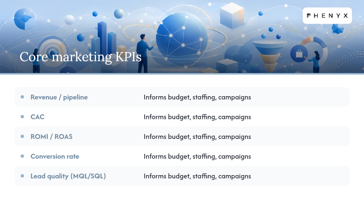
The core set includes marketing-sourced revenue or pipeline, CAC, ROMI or ROAS, conversion rates, and lead quality (MQL/SQL volume). These pass the Decision Test because they directly inform budget, staffing, or campaign decisions.
How many KPIs should a marketing dashboard have?
Limit each view to 5 to 7 hero KPIs. Most dashboards track 30 to 50 metrics overall, but only a handful actually drive real decisions, so push the rest to secondary drill-downs.
What tools do marketers use to build dashboards?
Common sources include GA4, Looker Studio, Tableau, HubSpot, Google Ads, Salesforce, and Marketo. The tool matters less than the metric strategy behind it; a well-designed dashboard in any of these platforms beats a cluttered one in a “better” tool.
How often should a marketing dashboard be reviewed?
Cadence should match the decision speed it supports: paid campaign dashboards often need weekly or even daily checks, while executive dashboards typically run monthly or quarterly. Run a full metric audit every quarter regardless of cadence.
Why do marketing dashboards often show conflicting numbers?
Attribution mismatches between platforms, like Google Ads counting a conversion differently than GA4, are the most common cause. Assigning a single source of truth for each KPI and documenting it next to the metric prevents the confusion.
Table of Contents
- Quick Summary
- What Is a Marketing Dashboard and Why Does It Matter?
- What Types of Marketing Dashboards Should You Build?
- Which Marketing KPIs Actually Belong on a Dashboard?
- How Do You Design a Dashboard People Will Actually Use?
- How Do You Build a Marketing Dashboard Step by Step?
- What Do Ready-to-Use Dashboard Templates Look Like?
- Who Owns a Dashboard and How Often Should It Be Reviewed?
- How Do You Run a Quarterly Dashboard Audit?
- Why Most Dashboards Fail Before Anyone Notices
- Need Help Turning Your Data Into a Working Dashboard?
- Sources
Quick Summary
- Audit your existing metric list and count how many numbers nobody actually uses.
- Choose 5 to 7 hero KPIs per dashboard view instead of one crowded master list.
- Assign a single source of truth for each metric so Google Ads and GA4 stop disagreeing.
- Set a review cadence and a named owner for every dashboard.
- Build from templates (CMO snapshot, paid media, SEO, email, funnel) rather than starting blank.
- Run the Decision Test on every widget, then audit quarterly to retire dead metrics.
What Is a Marketing Dashboard and Why Does It Matter?
A marketing dashboard is a live view that connects campaign activity to pipeline and revenue, not a static report you build once and forget. The point is decision speed. A good dashboard lets you reallocate budget mid-quarter, catch a conversion rate drop before it becomes a quarterly miss, and give your CFO a straight answer about marketing’s contribution to revenue.
HubSpot’s 2026 analysis found that 65% of marketers now meet or exceed their performance benchmarks, and the shift correlates with a move away from vanity metrics toward KPIs tied to revenue, quality, and efficiency. Teams that prioritize lead quality, conversion rate, ROMI, and CAC over impressions and likes make faster, better-supported calls.
Most dashboards pull from a familiar stack: GA4, Looker Studio, Tableau, HubSpot, Google Ads, Salesforce, and Marketo all show up repeatedly as data sources, regardless of company size. None of these tools fixes a bad metric strategy on its own. The dashboard is only as useful as:
- The clarity of the decisions it’s built to support
- The comparative context attached to each number
- The discipline behind which metrics even make the cut
What Types of Marketing Dashboards Should You Build?
Different stakeholders need different dashboards. A CMO doesn’t need campaign-level CTR data, and a paid media manager doesn’t need boardroom pipeline summaries. Match the dashboard type to the decision it supports.
- Executive/CMO dashboard: Answers “is marketing contributing to revenue?” Core metrics: marketing-sourced revenue, ROMI, pipeline influenced, CAC, CLV:CAC ratio. Reviewed monthly or quarterly.
- Paid campaign dashboard: Answers “where should we shift ad spend this week?” Core metrics: ROAS, CPA, CTR, conversion rate by channel. Reviewed weekly, sometimes daily during active campaigns.
- SEO/content dashboard: Answers “which content is actually driving pipeline?” Core metrics: organic sessions, keyword rankings, organic-to-lead conversion, content-attributed revenue. Reviewed monthly.
- Email/lifecycle dashboard: Answers “is our nurture sequence converting?” Core metrics: open rate, CTR, list growth, email-attributed conversions. Reviewed biweekly.
- Funnel/pipeline dashboard: Answers “where are leads stalling?” Core metrics: MQL-to-SQL rate, stage conversion rates, average deal velocity. Reviewed weekly.
- Social/brand dashboard: Answers “is engagement translating to reach or leads?” Core metrics: engagement rate, share of voice, follower growth tied to campaign spikes. Reviewed monthly.
The mistake most teams make is building one dashboard and forcing every audience to scroll past irrelevant charts to find their answer.
Which Marketing KPIs Actually Belong on a Dashboard?
Not every metric deserves dashboard real estate. Some are core (put them on every hero view), some are supporting (useful for drill-downs), and some are optional noise dressed up as data.
Hero KPIs tie directly to revenue and efficiency:
- Marketing-sourced revenue: total closed revenue attributable to marketing touches. Calculation: sum of closed-won deals tagged with a marketing source.
- Pipeline generated: total opportunity value created from marketing-influenced leads. Dashboards that skip a revenue or pipeline metric leave the CFO’s core question unanswered.
- CAC (Customer Acquisition Cost): total marketing spend divided by new customers acquired in the period.
- CLV:CAC ratio: customer lifetime value divided by CAC. A ratio below 3:1 usually signals inefficient spend.
- ROMI (Marketing ROI): (revenue attributable to marketing minus marketing cost) divided by marketing cost.
- Conversion rates: visitor-to-lead and lead-to-customer rates, tracked separately since they diagnose different funnel stages.
- MQL/SQL volume and lead quality: raw lead count paired with the percentage that sales accepts as qualified.
| KPI | Quick Calculation | Priority |
|---|---|---|
| Marketing-sourced revenue | Sum of closed-won deals with marketing attribution | Core |
| CAC | Total marketing spend ÷ new customers | Core |
| ROMI | (Revenue attributed to marketing − cost) ÷ cost | Core |
| Lead-to-customer conversion rate | Customers ÷ total leads in period | Core |
| Organic sessions | Sessions from unpaid search (GA4) | Supporting |
| CPA | Ad spend ÷ conversions | Supporting |
| Bounce/engagement rate | Engaged sessions ÷ total sessions (GA4 metric) | Optional |
Supporting metrics like CTR, CPC, and session-to-conversion by landing page matter for diagnostics, but they belong in drill-downs, not the hero row. Email open rate deserves a caveat: with Apple’s Mail Privacy Protection inflating opens artificially, treat it as a directional signal rather than a hard KPI.
How Do You Design a Dashboard People Will Actually Use?
Visual hierarchy is not decoration. It’s the difference between a dashboard someone checks daily and one that gets ignored after week two. Put your 5 to 8 hero KPIs top-left, where eyes land first, and push diagnostic drill-downs behind a click.
Every metric needs comparative context. Dashboards that show a number in isolation invite guesswork about whether it’s good or bad. Pair each KPI with period-over-period change, year-over-year change, or goal versus actual, so a viewer can tell a real anomaly from normal noise in three seconds.
A few visual rules worth following:
- Limit color use to signal status (red/yellow/green against target), not decoration.
- Annotate thresholds directly on the chart, like “CTR below 1% triggers creative review.”
- Label the data source and refresh date on every widget. Nobody should have to guess if a number is from Salesforce or HubSpot.
- Keep each view to 5 to 7 hero metrics; push everything else to a secondary tab.
Pro Tip: Set a small goal line or target band directly on the chart itself instead of a separate number nearby. A viewer scanning quickly catches “below target” instantly, without reading two numbers and doing subtraction in their head.
How Do You Build a Marketing Dashboard Step by Step?
- Identify stakeholders and their decisions. Ask what call each audience needs to make weekly, monthly, or quarterly.
- Apply the Decision Test to every candidate metric. If a metric doesn’t inform a specific decision, drop it from the initial build.
- Choose hero KPIs and set cadence. Match refresh frequency to how fast the underlying decision needs to move.
- Map data sources. Most builds pull from GA4, Google Ads, HubSpot, Salesforce, and Marketo. Confirm which system owns each metric before connecting anything.
- Build connectors and validate formulas. Attribution mismatches between Google Ads and GA4 are the most common source of numbers that don’t reconcile.
- Assign ownership and set alerts. Someone’s name goes next to every KPI.
- Iterate after real meetings. Cut what nobody references; promote what keeps coming up.
A structured approach to ad tracking at the connector stage prevents most of the blended-table errors that make dashboards untrustworthy.
What Do Ready-to-Use Dashboard Templates Look Like?
- CMO snapshot: Marketing-sourced revenue, ROMI, pipeline influenced, CAC, CLV:CAC ratio. Supports budget reallocation decisions. Reviewed monthly.
- Paid media performance view: ROAS, CPA, CTR by channel, spend pacing. Supports pause/scale decisions on active campaigns. Reviewed weekly.
- SEO/content performance: organic sessions, keyword position changes, content-attributed pipeline. Supports which topics get next quarter’s content investment. Reviewed monthly.
- Email lifecycle dashboard: CTR, list growth, email-attributed conversions. Supports sequence and segmentation adjustments. Reviewed biweekly.
- Funnel/pipeline health view: stage conversion rates, deal velocity, MQL-to-SQL rate. Supports where sales and marketing intervene together. Reviewed weekly.
Each of these is replicable in Looker Studio, Tableau, or whatever BI tool your team already licenses. The template matters less than whether every widget on it passes the Decision Test.
Who Owns a Dashboard and How Often Should It Be Reviewed?
Every KPI needs a documented definition and a named source of truth, or you’ll end up with three teams quoting three different conversion numbers in the same meeting. Tableau’s dashboard guidance makes the same point: certify the data and align it to organizational priorities, or nobody trusts the dashboard enough to act on it.
- Assign one owner per dashboard, not per company.
- Attach every dashboard to a recurring meeting, not a standalone report nobody opens.
- Require a short “so what” note after each review: what decision did this dashboard actually cause?
- Run a quarterly review that checks whether each hero KPI still earns its spot.
- Confirm the source-of-truth system for each metric.
- Check whether any two dashboards report conflicting numbers for the same KPI.
- Retire any metric with no documented decision behind it in 90 days.
How Do You Run a Quarterly Dashboard Audit?
The Decision Test is a single question: “When I look at this, what decision will I make?” No clear answer means the metric doesn’t belong on the hero view. Most dashboards track 30 to 50 metrics total, but real decisions come from only 3 to 5 of them, and teams routinely cut 30 to 50% of their metrics in a first audit without losing any decision-making power.
Run this checklist once a quarter, in under an hour:
- List every metric that drove a documented decision in the last 90 days.
- Flag metrics nobody referenced in a meeting all quarter.
- Retire the flagged metrics or move them to a secondary drill-down tab.
- Promote any recurring “what about X?” question into a hero KPI.
- Confirm comparative context (PoP, YoY, goal) still exists on every remaining widget.
Pro Tip: Ask each stakeholder one question before the audit: “What’s a number you keep asking about that isn’t on the dashboard?” Their answer usually reveals a metric worth promoting, or one worth cutting because they stopped caring.
Why Most Dashboards Fail Before Anyone Notices
Across the accounts Phenyx works on, the pattern repeats: teams add metrics faster than they remove them, and within a year the dashboard becomes a wall nobody reads closely. A structured approach to metric selection, applied early, prevents that drift.
Clients who tighten their KPI list to a handful of hero metrics typically report faster budget conversations and fewer “whose numbers are right” arguments in review meetings. The fix isn’t more data. It’s fewer, better-defined numbers everyone trusts.
Need Help Turning Your Data Into a Working Dashboard?
If your team is drowning in spreadsheets pulled from five different platforms, building a clean dashboard yourself can eat a quarter you don’t have. Phenyx handles the parts that usually stall internal projects: connecting GA4, Google Ads, and CRM data into one reliable view, setting up conversion tracking that actually reconciles, and designing the visual layer so stakeholders read it in seconds instead of asking follow-up questions.
This isn’t a bolt-on report. It’s part of how Phenyx approaches website design and paid ads and PPC work: tracking gets built in from the start, not patched on after launch. If your current setup can’t tell you which campaigns actually drove revenue last quarter, that’s worth a conversation. Request a dashboard and tracking audit through Phenyx’s website design services and get a clear picture of what your data can actually tell you.
Sources
- Optimizing performance metrics (HubSpot, 2026)
- Marketing Dashboard KPIs: A 2026 Decision Playbook
- How to overcome common mistakes in dashboard design
- Marketing dashboards dos and don’ts (Tableau whitepaper)
Recommended
- Beyond Clicks and Impressions: Elevating Your Marketing Game with Ad Tracking | PHENYX
- How to Prepare for a Quarterly Marketing Meeting and Set Your Brand Up for Success | PHENYX
- How to Prepare a Strong Marketing Campaign for 2026: Ideas and Tips Every Business Can Use | PHENYX
- It’s 2020: Do you know where you social media management is? | PHENYX