


If you are a designer, developer, or just someone who likes to stay up-to-date on the latest trends in web design, this blog post is for you. It discusses 12 of the most important web design trends that will shape how we use and experience websites over the next few years. We hope that these tips will help you stay ahead of the curve and build a website that will stand out from all others!
1. 3D visuals
Last year was all about neumorphism, or ‘soft UI’ – a kind of embossed or debossed graphic effect. This year though, web designers have embraced skeuomorphism, or three-dimensionality. There is a lot to consider with this trend – but if you are not sure where to start, we recommend using shadows and animation.
Shadows can help create the illusion of depth for flat designs by creating an eyecatching focal point on your design. Animations work well as they have eye-catching movement that will keep people engaged in your site’s content longer than other static images would.
2. Augmented reality
The trend for augmented reality (AR) stretches beyond web design and moves into all areas of life. In the past, AR had been something that was seen as a gimmick – but now it is being used in more and more industries to supercharge how we interact with our devices and content.
AR can be applied to your website design by utilizing new technologies including motion tracking cameras, head-mounted displays, or virtual reality headsets for visitors who want an immersive experience. If you are not sure where to start, try using Lottie files, web-based animated vector art!
3. Bold Type
This is one of the easiest ways for your brand to make a statement because the content on your website is the first thing that visitors see. Whether you are using a serif or sans-serif font, make sure to use at least two different weights for text so there's enough contrast between them.
For example: Heading in bold and regular weight typeface; Call-to-action button in big bold letters with minimal copy beneath it.
This will allow users to scan through more quickly which can increase engagement time because they don't need to cycle back around as often to find what they were looking for originally!
It also makes fonts easier to read and places emphasis on important areas of your page that would otherwise be less prominent if everything was the same size/weight.
4. Gradients
A visual trend with staying power, you’ve probably got at least a handful of apps on your phone with gradient-style icons.
These striking color combinations are not just for apps, though. Gradients can be used to color backgrounds or other design elements on your site.
Gradients allow designers a lot of artistic freedom with the colors and gradation they use, but this also means that it's difficult to pull them off without looking dated.
For instance: background images with gradient-to-white effects become more popular as time goes on; transition from one shade into another (i.e., purple gradually turning lighter) is often paired with an animation effect in order to keep up with current trends!
5. Illustrations
Slick animations and 3D visuals might be all over the internet this year, but so are sweet sketches and line drawings.
You can also use illustrations as a way of adding variety or creating consistency throughout the design with a seamless transition from one image to another.
If you're feeling really ambitious, consider illustrating all the text in your posts instead of typing it out word-for-word! This is an excellent option if you are writing something like poetry which benefits immensely from simple illustration. Illustrating your words might even be more beneficial than using typography since they will likely stand out more against other images that may be used alongside them
6. Gaussian Blurs
Sometimes used to give the same visual impact as a gradient, blurring elements is an effective way to bring focus to text overlaying images.
Gaussian blurs work best when they're in the background with a solid color, or on top of text; any other use tends to be less visually appealing.
It’s a pretty simple element that can easily improve the modern feel of your website.
7. Horizontal scrolling
Disruptive design: some people love it, others roll their eyes at it.
It's a trend that is starting to pop up on more and more websites, but it can be difficult to get right.
If you're going for this type of design, make sure the animation is fluid and doesn't confuse the user.
We recommend experimenting with how scrolling horizontally affects the feel of your website – if done well, it will give users a sense they are in control over what information they would like to explore next.
8. Unconventional scrolling
Making websites hyper-responsive to scrolling is a great way to boost visitor interaction.
Lots of designers are exploring ways to make scrolling the website a more involved process, but we must remember that scroll jacking is not always welcomed.
Scroll down jacks the users out of their current position on the site and presents them with new information at random – in this case you need to be specific about what they will see when scrolling down.
A better way for unconventional scrolling might be to offer it as an option so visitors can decide if they would like to give it a try or not.
Reviewing your visitor analytics can help tell which pages have high engagement rates with users who scroll, while those left unread could benefit from making use of different types of scrolling methods.
9. Muted background colors
Dark mode is everywhere now, from Slack to Facebook. Thanks to its popularity (and supposed health benefits), it’s now a trend.
A lighter background can help with legibility, especially on devices like laptops or mobile phones that may not have the best brightness settings and also for those who prefer to use their computers in low-light environments such as nighttime.
The lack of contrast between text and its background makes it difficult to read anything without glasses – so don’t forget about your content when you are designing!
10. Vibrant color combinations
While some web designers might opt for sugary sweet tones, others are having fun with zesty brights.
In a nutshell, 2021’s color trends are about expanding your range to include a wider spectrum of colors.
The way a business presents itself to the public should be professional and on-point, but not monotonous. Vibrant colors like reds, oranges, or even blues work well with fun features as paint splashes and motion graphics for an eye-catching presentation that leaves your audience in awe of what you're offering them.
11. Custom cursors
People often think that the only factor to consider when building a site is its functionality. They soon learn, however, that how users interact with your website has an enormous impact on their perception of it as well. This trend not only makes for some good looking sites but can also help you build a stronger connection with visitors by giving them something more than just content they're expecting or what's necessary in order to complete tasks like buying tickets online and browsing through products at retail stores without having any trouble finding what they want quickly. You don't even need web design skills! Customizing cursor icons is easy enough anyone can do it!
12. No Coding
Developing software has never been more accessible. No-code platforms such as Elementor, Wix and Squarespace allow users to create functional websites without any coding skills.
Designing a user interface with no code means using drag-and-drop features and allowing users to edit information on the fly as opposed to having to log into an admin panel where they can only update content about their own account or pages within their set permissions.
No coding speeds up the development process, and the flexibility of the design tool means users can make adjustments as they go without having to worry about inputting code. The no coding revolution is an exciting new trend in the development world. With integrations, 3rd party software, and automation, designers are able to build incredible websites without any code whatsoever.
This trend will continue on into 2022 because of its benefits for small business owners and entrepreneurs who don't have a technical background, designers that are pressed for time, or those just starting out in web development.
The future is no coding!
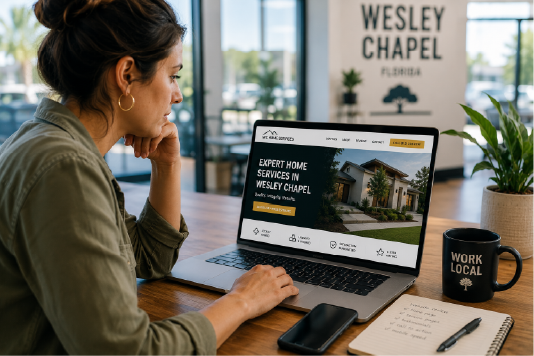
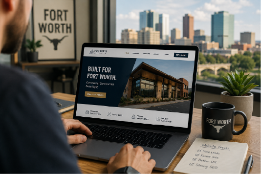
Our Solution
Web design is never easy--even when it should be simple enough there’s always some new challenge waiting in the wings. This leaves room for mistakes, which nobody wants on an already challenging project; however, PHENYX has experience working through these challenges so our customers get peace of mind knowing we have them covered. Reach out today if you want help creating lasting impressions with those important first-time visitors.


%20(2).svg)
%20(1).svg)
