

Brand Identity vs Logo: Choose a Mark or a Full System
A logo is a single visual mark, or a small family of marks, built to identify a brand at a glance. Brand identity is the complete designed system, visual and verbal, that governs how a brand looks, sounds, and behaves across every touchpoint. A logo lives inside that system, but on its own it cannot enforce the consistency a growing brand needs.
TL;DR:
- If multiple people create marketing materials, document color, type, logo sizing, imagery, voice, and layout rules so others can apply the brand consistently.
- Choose a full identity system when you use web, social, print, and signage, or expect new locations, products, team members, or audience segments.
- Before approving a logo, test it on a business card, social post, website header, email signature, and product label to catch usability problems.
- A logo is a design asset, not trademark protection; registering a domain or business name alone does not grant rights to the logo or name.
Table of Contents
- Brand, Branding, Brand Identity, and Logo: Getting the Terms Straight
- Core Components of a Brand Identity System
- How a Logo Functions Inside the Bigger System
- Do You Need a Full Identity System or Just a Logo?
- How Agencies Build Identity Systems: A PHENYX Perspective
- Why This Distinction Matters More Than Most People Think
- Ready to Build a Brand Identity That Holds Up Everywhere
- FAQ
- Sources
Brand, Branding, Brand Identity, and Logo: Getting the Terms Straight
Confusion about these four words causes most of the frustration we see in branding conversations, so let’s separate them cleanly.
Brand is the perception that exists in someone’s mind: the reputation, associations, and gut feeling a person has about a company. We don’t fully control it, because it forms through every interaction a customer has with us.
Branding is the set of strategic actions we take to build and manage that perception over time. It includes positioning decisions, messaging, customer experience choices, and design work.
Brand identity is the tangible, designed expression of the brand: the assets and rules that make the brand recognizable and consistent. This includes color, typography, imagery, voice, and the documentation that ties them together.
Logo is the mark itself, and marks come in a few standard types:
- A wordmark spells out the brand name in custom lettering, like a stylized typographic treatment of a company name.
- A pictorial mark uses a recognizable image or icon tied directly to the brand.
- An abstract mark uses a geometric or symbolic shape with no literal meaning on its own.
- A combination mark pairs a wordmark with a symbol, often used together and sometimes separately.
Design educators are blunt about this distinction. As practitioners writing for AIGA’s Eye on Design point out, the logo is not the identity. Identity is a system of elements that reveals a brand’s personality, and that system only works when it’s documented clearly enough for other people to apply it correctly.
Core Components of a Brand Identity System
A complete identity system gives every person who touches the brand, from a junior designer to an outside vendor, the same set of rules to follow. Here’s what typically makes up that system.
- Color palette and usage rules, including primary and secondary colors along with accessibility guidance for contrast and legibility.
- Typography hierarchy, covering primary typefaces, heading and body styles, and web-safe fallback fonts for digital use.
- Logo suite and lockup rules, specifying approved variants, minimum sizes, and clearspace requirements around the mark.
- Imagery and photographic direction, setting the tone for how people, products, and environments get photographed or illustrated.
- Graphic elements, iconography, and layout grids that give supporting materials a consistent structural feel.
- Voice and tone guidelines, with short example phrases showing how the brand sounds in a headline versus a customer service reply.
- Final deliverables, usually a brand guidelines document, organized asset files, and sample applications showing the system in use.
AIGA’s overview of identity design describes this as a kit-of-parts: colors, type, and supporting elements built for consistent application, not a single static image.
Pro Tip: Before approving a logo, ask to see it applied to five real situations, a business card, a social post, a website header, a signature, and a product label, so you catch usability problems before they become expensive.
A guide on fixing brand consistency across channels walks through how these rules get enforced once multiple teams start producing content.
How a Logo Functions Inside the Bigger System
A logo’s job is to help quickly identify the source of a brand. Brand identity has a bigger job, which is creating meaning and emotional association over repeated exposure.
- A logo answers “whose brand is this?” in under a second.
- Brand identity answers “what does this brand stand for, and can I trust it?” over many interactions.
- A logo used outside its approved color, scale, or clearspace rules weakens recognition instead of strengthening it.
- Supporting rules for background contrast, minimum size, and acceptable crops exist precisely because a logo breaks down fast without them.
Design choices in a logo carry measurable perceptual weight. Visual properties like symmetry, balance, and geometry can shape how people judge a brand’s utilitarian versus hedonic benefits, according to design research summarized by the American Marketing Association. A structured, geometric mark can reinforce claims about reliability and function, while a looser, organic mark can support claims about pleasure or indulgence. That’s one reason a logo decision should never happen in isolation from the broader identity strategy.
Do You Need a Full Identity System or Just a Logo?
Scope the project honestly before you commission anything. Run through this checklist first.
- Count your content creators. If more than one person produces marketing materials, you need documented rules, not just a file.
- Count your channels. A brand living only on one storefront sign has different needs than one running social, web, print, and signage at once.
- Check your growth plans. A business expecting to add product lines, locations, or team members soon should build the system now rather than rebuild it later.
- Assess your offering’s complexity. Multiple service lines or audience segments usually require sub-brand or messaging guidance beyond a single mark.
- Follow the standard process. Most agencies move through brief, research, concepts, identity documentation, and rollout, with timelines that stretch from a short, low-scope logo refresh to a longer multi-channel identity build.
One practical litmus test holds up well: if someone else needs to produce on-brand materials without you in the room, you need a documented system, not just a logo file.
Before you commission anything, know that a logo and a trademark are not the same thing. A trademark is a legal protection for source identifiers, including names, slogans, and logos, and it’s separate from the design concept of brand identity. The USPTO’s trademark process guidance explains that registering a domain name or a DBA does not grant trademark rights on its own.
How Agencies Build Identity Systems: A PHENYX Perspective
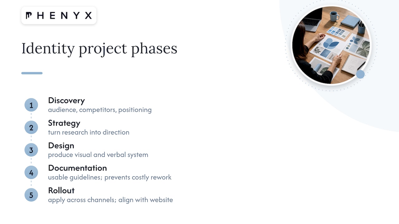
We move identity projects through five phases: discovery, strategy, design, documentation, and rollout. Discovery uncovers audience, competitors, and positioning; strategy turns that research into direction; design produces the visual and verbal system; documentation locks it into usable guidelines; rollout applies it across real channels.
What we hand over includes brand standards documentation, organized asset files, application examples across common formats, and alignment between the identity and the client’s website. A structured approach exists specifically to prevent common expensive mistakes: paying to redo design work because nobody wrote down the rules the first time.
Readers ready to scope a project can review our branding service page for a sense of what a brief typically covers.
Why This Distinction Matters More Than Most People Think
Skipping the system and keeping only a logo file sets up a brand for inconsistent colors, mismatched fonts, and off-tone messaging the moment more than one person touches the brand. A documented identity system catches those errors before they reach a customer, which is where perception, and eventually loyalty, actually gets built.
— PHENYX
Ready to Build a Brand Identity That Holds Up Everywhere
Brand identity can be treated as infrastructure, not decoration. Handling strategy, design, and documentation under one roof helps ensure the color palette a web designer uses matches the one on signage, ads, and product launches without a second round of guesswork.
A short discovery conversation is usually enough to tell you whether your business needs a full system now or can start with a focused logo update and grow into the rest later.
- We scope every project around your current channels and your growth plans for the next two to three years.
- Deliverables include brand standards documentation, asset files, and real application examples, not just a single logo file.
- Our website design and graphic design teams apply the identity consistently once it’s built.
| What you’re deciding | Logo only | Full identity system |
|---|---|---|
| Content creators involved | One | Multiple |
| Channels in use | Single storefront or sign | Web, social, print, signage |
| Growth plans | Stable, no near-term changes | Expansion, new locations, or product lines |
Submit a brief through our Branding page or ask about our MODS subscription if you want ongoing design support bundled with SEO, web, and ad management.
FAQ
What are the 5 pillars of brand identity?
Most identity frameworks point to five recurring pillars: visual design (logo, color, typography), voice and messaging, positioning, customer experience, and consistency across channels. Definitions vary slightly between agencies, but the common thread is that a logo represents only one piece of a much larger system.
What is the 3 7 27 rule of branding?
We couldn’t verify a standardized, widely recognized definition of this specific rule, so we won’t guess at numbers we can’t confirm. What’s well documented instead is that repeated, consistent exposure to a brand’s visual and verbal identity builds recognition over time, which is the principle most “rule of thumb” branding guidelines are trying to express.
What is an example of a strong brand identity beyond the logo?
Brands with strong identity systems apply consistent color, typography, photography style, and tone of voice across packaging, advertising, retail environments, and digital products, not just their logo mark. The logo stays recognizable precisely because everything surrounding it follows the same documented rules.
Is a logo the same thing as a trademark?
No. A logo is a design asset, while a trademark is a legal protection that distinguishes the source of goods or services from competitors. According to the USPTO, owning a domain name or business registration does not automatically grant trademark rights to a logo or name.
How do I start building a brand identity instead of just getting a logo made?
Start with a brief that covers your audience, competitors, and growth plans, then move through research, concept design, and documentation before rollout. Our branding and messaging guide walks through this process in more depth, and reviewing how consistency breaks down across channels is a useful gut check before you commit to a scope.
Sources
- Trademark process | USPTO
- How effective logos shape consumer beliefs — AMA summary
- 3 lessons in branding every student of design should know — Eye on Design (AIGA)