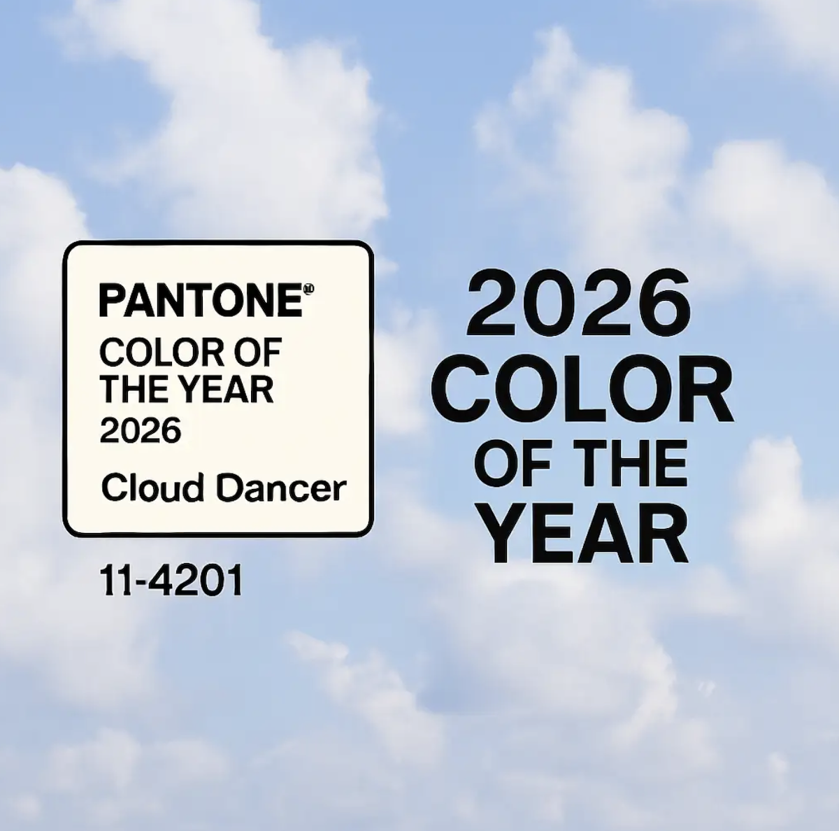
When color becomes culture, your brand should listen. Pantone Color Institute recently announced Cloud Dancer (PANTONE 11-4201) as the official 2026 Color of the Year, the first time a shade of white has ever received this honor.
Cloud Dancer’s airy, soft white tone captures a cultural shift toward calm, clarity, and fresh beginnings, a reaction to the noise, complexity, and overstimulation of modern life. For businesses and brands, this isn’t just a design trend. It’s an invitation to reevaluate visual identity, messaging, and how you want people to feel when they experience your brand.
At phenyx.co, we believe in building brands that resonate. Here’s why Cloud Dancer matters, and how you can use it to strengthen your brand identity in 2026 and beyond.

What Cloud Dancer Signals, Cultural Calm and Fresh Perspective
Pantone describes Cloud Dancer as “a lofty white neutral whose aerated presence acts as a whisper of calm and peace in a noisy world.” It’s not a stark, clinical white. Instead, it holds warmth and softness, a balanced neutral that feels refreshing, hopeful, and open to possibility.
In a year defined by uncertainty, overwhelm, and constant change, Cloud Dancer is both a visual reset and a calm anchor. It reflects a collective desire for simplicity, clarity, and space to breathe. For brands, this shift isn’t just aesthetic. It’s emotional.
Why Color of the Year Influences Branding and Marketing
The Pantone Color of the Year isn’t chosen at random. Each year, the Institute reviews global trends: culture, technology, social movements, design, art, and more, to pick a hue that reflects where society is headed.
When a color is declared “the color of the year,” it becomes a shared inspiration across design, fashion, interiors, product packaging, digital media, even marketing campaigns. Brands that lean into it can appear culturally attuned, modern, and emotionally relevant.
For many businesses, integrating Cloud Dancer doesn’t require a full rebrand. It’s about layering a new sensibility on top of your existing foundation, refreshing visuals, tone, mood, and emotional resonance with subtlety and intention.
How to Use Cloud Dancer to Refresh Your Brand (Without Overhauling Everything)
1. Use as a Primary or Accent Neutral
Cloud Dancer works beautifully as a background color, clean, minimal, and sophisticated. Use it in web design backgrounds, social graphics, print materials, or packaging. It pairs especially well with neutrals, muted tones, and bold accents.
2. Refresh Visual Collateral
Update photography filters, graphic overlays, or texture backgrounds across your brand’s visuals. A light, airy aesthetic built on Cloud Dancer brings consistency and calm across digital and physical touchpoints.
3. Give Your Brand a Visual Reset
Consider updating minor design elements, like buttons, icons, social templates, or presentation decks, with Cloud Dancer. It signals that your brand is evolving, adapting, and staying current.
4. Align Messaging with Mood
Use the tone of calm, clarity, and “fresh start” in your storytelling. A brand’s message and mood should match its coloring. Cloud Dancer works best when paired with messaging about renewal, simplicity, clarity, or thoughtful growth.
5. Combine with Signature Colors and Brand Identity
Cloud Dancer doesn’t replace brand color palettes, it complements them. Use it as a neutral backdrop to let your brand’s signature colors and fonts stand out. Think of it as a clean canvas for your brand to shine.
Real-World Examples: How Brands Can Benefit
- A wellness brand could redesign their website background in subtle Cloud Dancer tone, clean, restful, inviting trust and calm.
- An agency like PHENYX could update pitch decks, proposals, or social media graphics to reflect the airy neutral, giving visual consistency and modern polish.
- Product-based businesses (beauty, fashion, interiors) can use Cloud Dancer packaging to create a “light, timeless, elegant” vibe that appeals broadly and feels current.
This isn’t about chasing trends for trendiness. It’s about aligning visual identity with cultural mood, and creating an emotional resonance that lasts.
FAQs About Pantone Color of the Year and How to Use It
Does choosing the Color of the Year mean I should rebrand entirely?
Not at all. The Pantone Color of the Year should be treated as a source of inspiration — a seasonal trend. Most brands benefit from selective refreshes rather than full rebrands.
How often should I rethink my brand aesthetic?
A refresh every 2–3 years can keep your brand feeling current without losing its identity.
Can Cloud Dancer work for any industry?
Yes. Its neutrality and emotional tone make it versatile for industries from tech and consulting to wellness, fashion, and interior design.
Do I need professional design support to use it correctly?
It helps. But with thoughtful application, soft textures, balanced contrast, clear layouts, you can begin incorporating Cloud Dancer yourself.
Can PHENYX help me refresh my brand visuals for 2026?
Absolutely. Visit phenyx.co to explore brand refresh services, visual identity refinement, and content strategy aligned with today’s design trends.
Final Thoughts: A Blank Canvas for What Comes Next
The choice of Cloud Dancer as 2026’s Pantone Color of the Year reflects a world craving calm, clarity, and creativity. For brands willing to listen and evolve, this is a timely opportunity, a chance to refresh on how you look, how you speak, and how you make people feel.
If you’re considering a visual refresh or simply want to weave Cloud Dancer into your branding thoughtfully, the team at phenyx.co is ready to help you build something timeless, expressive, and beautifully aligned with the moments of 2026 and beyond.


%20(2).svg)
%20(1).svg)
