Digital Signage Content Ideas: 5 Types, Matched to Your Venue
Five content categories earn a permanent spot on any digital signage playlist: informational, promotional, engagement, operational, and recognition. The selection principle is simple. Match each piece of content to its location and audience, keep it legible and accessible, and refresh it on a set schedule so screens never go stale.
TL;DR:
- Place welcome and wayfinding screens in lobbies, menus and offers near checkout, live updates in transit areas, and shift boards in staff spaces.
- Single image slides need at least 5 to 7 seconds; most assets should stay visible for 10 to 15 seconds, with text heavy content longer.
- Caption every video, use high contrast and readable type, and pair color coded indicators with labels or icons so essential information remains accessible.
- Refresh the full playlist at least weekly, update news and transit continuously, and rotate promotions daily or weekly as deals change.
- Give each promotional screen one trackable QR code or short URL, then compare scans, conversions, and dwell time when the hardware supports measurement.
Table of Contents
- Quick Summary
- 1. Informational Content That Earns Attention
- 2. Promotional Content That Drives Action
- 3. Engagement Content That Builds Community
- 4. Operational Content That Keeps Things Running
- 5. Recognition Content That Builds Culture
- Which Content Ideas Fit Your Venue?
- Design and Accessibility Rules Worth Testing
- Building a Rotation and Measurement Plan
- How We Approach Digital Signage Production
- A Few Predictions Worth Planning For
- Let Us Build Your Signage Content Engine
- FAQ
- Sources
Quick Summary
- Pair lobbies with welcome and wayfinding content, point-of-sale screens with menus or offers, corridors with news, and staff areas with shift boards.
- Keep fast-moving promotional slides on screen for about 10 to 15 seconds, following Texas A&M’s dwell-time guidance.
- Use denser informational content a bit longer, and reserve the shortest slots for single images or countdowns.
- Add one QR code or short URL per screen tied to a trackable landing page.
- Check contrast and font size against accessibility guidance before launch.
- Track QR scans and dwell time where hardware allows, then adjust the weakest slides first.
- Rotate the full playlist at least weekly to avoid cognitive blindness.
1. Informational Content That Earns Attention
Wayfinding, real-time news, transit updates, weather, schedules, and FAQs form the backbone of most signage networks. They work because audiences primarily look to digital signage for convenient, useful information rather than entertainment, and that holds true across age groups, with older viewers showing even stronger intent to engage with informational displays.
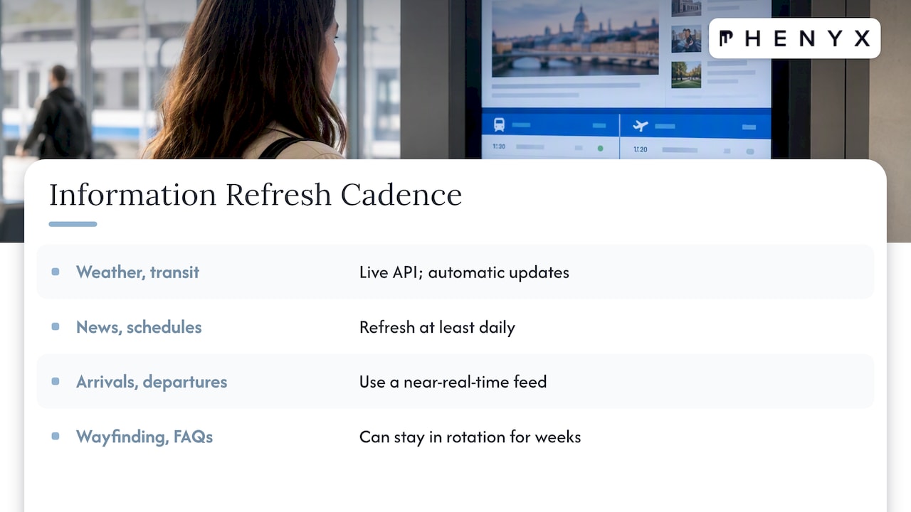
Pull weather and transit feeds from a live API so they update automatically rather than relying on someone to refresh a slide by hand. News and schedule content should refresh at least daily, and anything tied to arrivals, departures, or room bookings needs a near real-time feed. FAQs and static wayfinding maps can stay in rotation for weeks since they answer a question that doesn’t change.
2. Promotional Content That Drives Action
Limited-time deals, countdowns, digital menu boards, and sponsorship slides belong on screens near a point of purchase. A countdown to a weekend sale or a happy-hour menu board gives viewers a reason to act in the next few minutes, not just awareness for later.
Every promotional slide needs a clear call to action: a QR code or a short, easy-to-type URL that lands on a page built to track conversions. Price changes on digital menu boards should go through the same approval step every time, since an outdated price on a public screen creates a real compliance headache at the register.
3. Engagement Content That Builds Community
Social media walls, user-generated content highlights, live polls, and leaderboards turn a one-way screen into something people want to check. A curated feed of tagged photos or reviews gives visitors proof that other people are enjoying the space, and a live poll during an event gives attendees a reason to glance up.
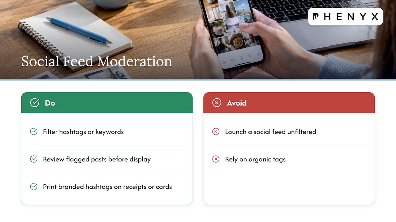
Moderation matters here. Set a simple filter for hashtags or keywords before any social feed goes live, and have someone review flagged posts before they reach the big screen. Source user-generated content with a standing call to action, like a branded hashtag printed on receipts or table cards, rather than hoping for organic tags.
4. Operational Content That Keeps Things Running
Meeting-room status boards, building notices, staff shift boards, and maintenance alerts solve real logistics problems instead of trying to sell or inform the public. A red or green indicator outside a conference room saves a dozen awkward door-opens a day. Shift boards near a staff entrance replace a printed sheet that’s always a week out of date.
Keep operational screens separate from public-facing playlists where possible, since mixing an internal maintenance alert with a customer promotion confuses both audiences.
5. Recognition Content That Builds Culture
Employee spotlights, sales leaderboards, and customer testimonials cost little to produce and carry outsized goodwill. A monthly “employee of the month” slide or a live sales leaderboard in a break room gives staff a reason to care about the screen instead of ignoring it.
Customer testimonials work best near entrances or checkout, where a new visitor can see social proof before they commit to a purchase. Rotate recognition content on a slower cycle than promotions, since the value here is in repetition and familiarity rather than urgency. A broad idea catalog built around purpose and industry is a useful reference when a playlist feels thin in any one category.
Which Content Ideas Fit Your Venue?
Different venues need different starter playlists. Preferences also shift by age and setting, with younger viewers gravitating toward personal-interest content while older viewers favor public-interest information, so a single playlist rarely works for every location in a building.
- Retail: hero promo, product spotlight, live inventory or stock cue, wayfinding to checkout, loyalty program CTA.
- Corporate office: visitor welcome message, meeting room schedule, a KPI snapshot, HR recognitions, a short training tip.
- Hospitality and front-of-house: local event highlights, dining offers, check-in queue times, weather and transit updates.
- Education: class schedules, event notices, campus alerts, student recognition boards.
- Healthcare: check-in instructions, estimated wait times, visiting hours, general health tips that avoid any diagnostic claims.
- Transit: arrival and departure times, service advisories, wayfinding, safety reminders.
Start with three or four items from the matching list, run them for a few weeks, then add from the broader categories above once the basics are working.
Design and Accessibility Rules Worth Testing
Public-facing signage carries real accessibility obligations. Accessibility guidance for digital signage recommends never relying on audio alone, keeping contrast and font size appropriate to viewing distance, and captioning every video. The American Alliance of Museums adds that essential information needs a non-audio, non-color-dependent alternative, since some viewers can’t distinguish color status indicators at all.
Dwell time matters as much as design. A short, image-led slide needs at least 5 to 7 seconds on screen; a slide with a sentence or two of text needs longer. Avoid heavy animation that competes with the message itself, and rotate layouts occasionally so returning viewers don’t tune the screen out entirely.
- Use alt text on any archived image assets.
- Caption every video, no exceptions.
- Choose high-contrast color palettes and confirm them with a contrast checker before launch.
- Pair any color-coded status with an icon or label, not color alone.
- Provide a text or printed alternative for anything essential, like emergency instructions.
Pro Tip: Test every new template on the actual screen, in the actual room, before it goes live. Fonts that read clearly on a laptop often wash out under fluorescent light or direct sun.
Building a Rotation and Measurement Plan
A playlist only stays effective if it changes on a schedule and someone checks whether it’s working.
- Set real-time feeds like news and transit to update continuously, with no manual step involved.
- Refresh promotional content daily or weekly, depending on how often deals change.
- Rotate recognition content monthly or quarterly so it stays meaningful rather than routine.
- Track QR scans, CTA conversions, and dwell time where the hardware supports it.
- Run simple A/B tests between two versions of a CTA or visual and compare scan rates.
- Summarize three KPIs in a weekly snapshot, then build a monthly report that ties content changes to outcomes like foot traffic or conversions.
At least one scheduled content refresh per week is a practical minimum to avoid the kind of cognitive blindness that sets in when a screen shows the same static content too long, a pattern that quietly erodes attention and recall over time. A content calendar template makes that cadence easier to assign and track across a team. For additional scheduling frameworks, this content calendar overview covers workflow patterns that translate well to signage planning.
How We Approach Digital Signage Production
We build signage content the same way we approach any other channel: strategy first, then production, then measurement, all handled by one in-house team rather than passed between vendors.
- We start with a content audit of existing screens, locations, and audiences before recommending a playlist structure.
- We produce loopable video and captioned assets designed for the dwell times and contrast standards covered above, detailed further in our digital signage design guidance.
- We track outcomes like foot traffic and conversions against content changes, an approach outlined in our retail signage ROI breakdown.
- We recommend bringing in an agency once a signage network grows past a handful of screens or once measurement needs to outgrow a spreadsheet, with most clients seeing a refreshed playlist live within a few weeks of kickoff.
A Few Predictions Worth Planning For
Build a 4-week starter playlist before touching anything more ambitious, add one measurable CTA to every screen, and commit to a single A/B test within the next 30 days. Those three moves do more for a signage network than any amount of planning in the abstract.
Watch for data-driven rotation that adjusts automatically to performance, early experiments with gesture-based interaction instead of touch, and an accessibility-first approach to content that stops being optional and starts being the default.
— PHENYX
Let Us Build Your Signage Content Engine
Getting a signage playlist from idea to screen takes more than a list. It takes production, design, and a system for checking what’s working, which is exactly what we handle as one connected team instead of separate vendors.
- We produce the video loops, captioned assets, and templates your screens need through our video production and graphic design services.
- We design the visual system and accessibility standards behind every slide through digital signage design.
- We manage ongoing content, rotation, and reporting through our MODS marketing plans, starting at $4,000 per month.
Request a playlist audit or a short discovery call through our MODS page and we’ll map out what a working signage network looks like for your space.
FAQ
What content works best on digital signage?
Informational content like wayfinding and schedules tends to perform best because audiences look to signage primarily for convenient, useful information rather than entertainment. Promotional, engagement, operational, and recognition content round out a balanced playlist once the informational basics are covered.
How often should digital signage content change?
Real-time feeds like news and transit should update continuously, promotions should refresh daily or weekly, and recognition content can rotate monthly or quarterly. A full playlist refresh at least once a week helps prevent the cognitive blindness that sets in when content stays static too long.
How long should each slide stay on screen?
A short, image-led slide needs a minimum of 5 to 7 seconds, while denser text needs more time to read comfortably. University signage guidance recommends keeping most assets visible for 10 to 15 seconds to balance legibility with rotation speed.
What accessibility rules apply to digital signage?
Public-facing screens should never rely on audio alone, need adequate contrast and font size for the viewing distance, and should caption all video content, following established accessibility guidance. Essential information also needs a non-color-dependent alternative, since some viewers can’t distinguish status colors.
How do you measure digital signage performance?
Track QR code scans, CTA conversions, and dwell time where the display hardware supports attention tracking. Running simple A/B tests between two creative versions and comparing scan rates gives a practical starting point for optimizing a playlist over time.
Sources
- Investigating consumer behavioural intention to utilise digital signage
- Digital accessibility basics: digital signage
- Digital Signage Best Practices – Marketing & Communications | Texas A&M University
- Accessible Communications Guidelines – American Alliance of Museums
- 120 Ideas for Digital Signage Screens & Kiosks